 |
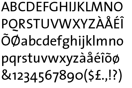
The upper-case 'Q' tail is below and separated from the circle.
|
 |
The '$' (dollar) has a single line which does not cross the 'S'.
|
 |
The '4' is closed.
|
 |
The centre vertex of the upper-case 'M' is on the baseline.
|
 |
The verticals of the upper-case 'M' are sloping.
|
 |
The lower-case 'g' is double-storey (with or without gap).
|
 |
The lower-case 'a' stem curves over the top of the bowl (double storey).
|
 |
The sides of the lower-case 'y' are angled (V-shaped).
|
 |
The lower-case 'e' has a straight horizontal bar.
|
 |
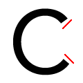
The ends of the upper-case 'C' stroke are vertical or nearly vertical.
|
Note that the fonts in the icons shown above represent general examples, not necessarily the two fonts chosen for comparison.
Show Examples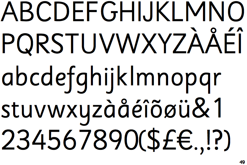
 |
The upper-case 'Q' tail crosses the circle.
|
 |
The '$' (dollar) has a single line crossing the 'S'.
|
 |
The '4' is open.
|
 |
The centre vertex of the upper-case 'M' is above the baseline.
|
|
The verticals of the upper-case 'M' are parallel.
|
 |
The lower-case 'g' is single-storey (with or without loop).
|
 |
The lower-case 'a' stem stops at the top of the bowl (single storey).
|
 |
The sides of the lower-case 'y' are parallel (U-shaped).
|
 |
The lower-case 'e' has a curved bar with no straight segment.
|
 |
The ends of the upper-case 'C' stroke are angled.
|