Identifont

Fonts by Appearance

Fonts by Name

Fonts by Similarity

Fonts by Picture

Fonts by Designer/Publisher

Differences

TweetTweet Differences

Compare: and  

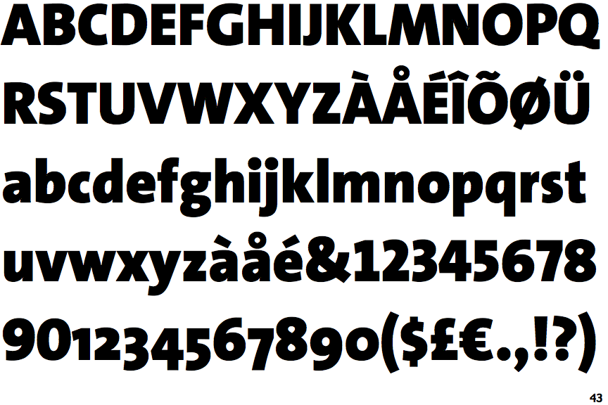
TheSans Black

TheSans Black

Sloping
The verticals of the upper-case 'M' are sloping.
2-Storey
The lower-case 'g' is double-storey (with or without gap).
Missing
The top of the lower-case 'q' has no spur or serif.

Note that the fonts in the icons shown above represent general examples, not necessarily the two fonts chosen for comparison.

Show Examples
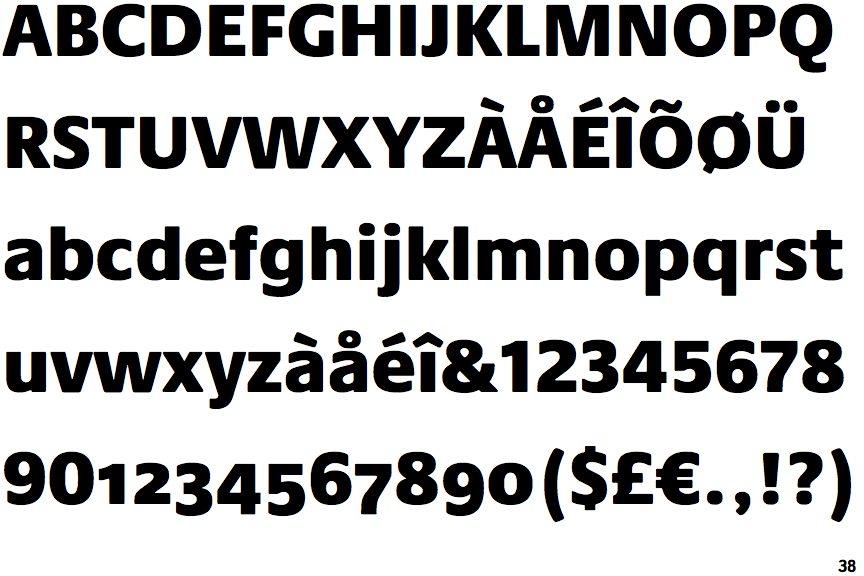
Praxis Next Black

Praxis Next Black

Parallel
The verticals of the upper-case 'M' are parallel.
1-Storey
The lower-case 'g' is single-storey (with or without loop).
Spur
The top of the lower-case 'q' has a vertical or slightly angled spur (pointed or flat).