Identifont

Fonts by Appearance

Fonts by Name

Fonts by Similarity

Fonts by Picture

Fonts by Designer/Publisher

Differences

TweetTweet Differences

Compare: and  

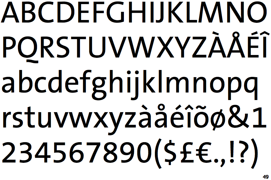
TheSans Basic

TheSans Basic

Below
The upper-case 'Q' tail is below and separated from the circle.
Single
The diagonal strokes of the upper-case 'K' meet at the vertical (with or without a gap).
2-Storey
The lower-case 'g' is double-storey (with or without gap).
No bar
The upper-case 'G' has no bar.
Straight
The leg of the upper-case 'R' is straight.

Note that the fonts in the icons shown above represent general examples, not necessarily the two fonts chosen for comparison.

Show Examples
Myriad

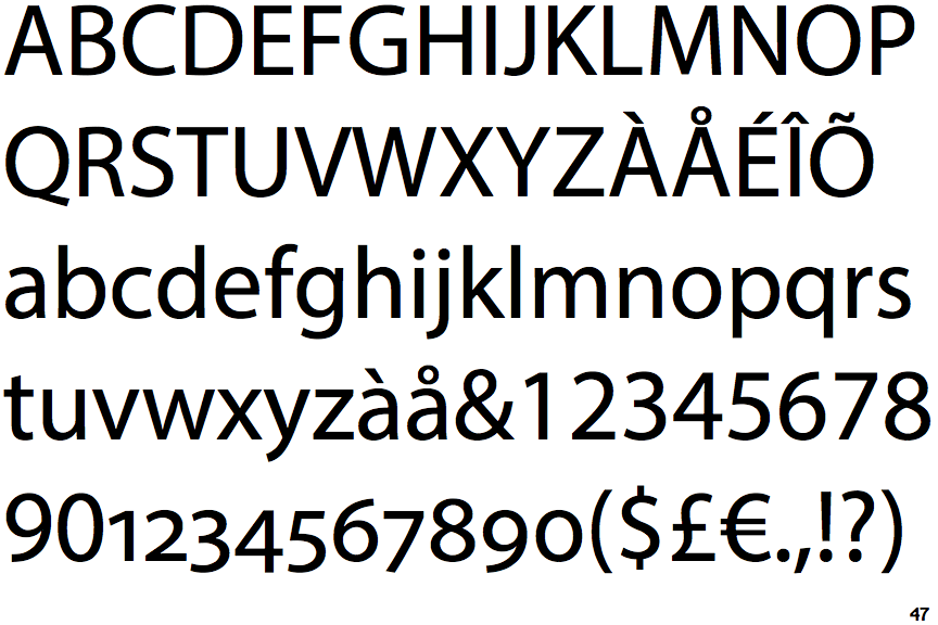
Myriad

Touches
The upper-case 'Q' tail touches the circle.
Double
The diagonal strokes of the upper-case 'K' meet in a 'T'.
1-Storey
The lower-case 'g' is single-storey (with or without loop).
Left
The upper-case 'G' has a bar to the left.
Outwards
The leg of the upper-case 'R' is curved outwards.