Identifont

Fonts by Appearance

Fonts by Name

Fonts by Similarity

Fonts by Picture

Fonts by Designer/Publisher

Differences

TweetTweet Differences

Compare: and  

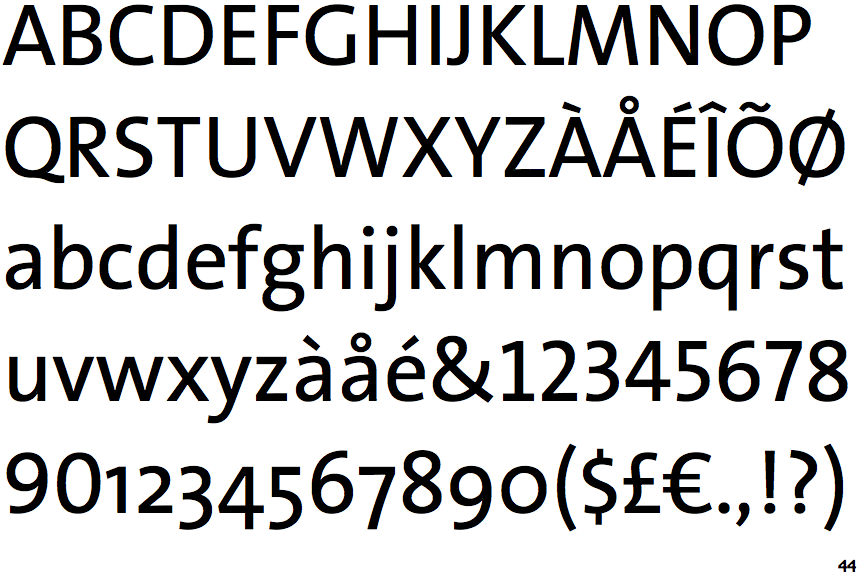
TheSans

TheSans

Sloping
The verticals of the upper-case 'M' are sloping.
No bar
The upper-case 'G' has no bar.
Straight
The leg of the upper-case 'R' is straight.
Missing
The top of the lower-case 'q' has no spur or serif.
Left
The tail of the lower-case 'y' is curved or U-shaped to the left.

Note that the fonts in the icons shown above represent general examples, not necessarily the two fonts chosen for comparison.

Show Examples
Calibri

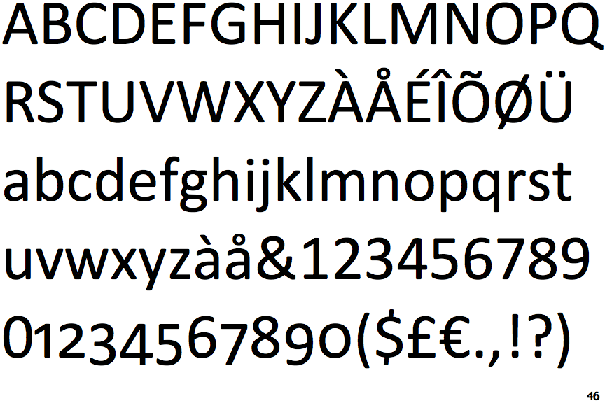
Calibri

Parallel
The verticals of the upper-case 'M' are parallel.
Left
The upper-case 'G' has a bar to the left.
Outwards
The leg of the upper-case 'R' is curved outwards.
Spur
The top of the lower-case 'q' has a vertical or slightly angled spur (pointed or flat).
Straight
The tail of the lower-case 'y' is substantially straight.