Differences
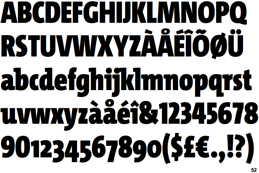
TheMix Condensed Black
 |
The dot on the '?' (question-mark) is circular or oval.
|
 |
The verticals of the upper-case 'M' are sloping.
|
 |
The top storey of the '3' is a smooth curve.
|
 |
The lower-case 'g' is single-storey (with or without loop).
|
 |
The upper-case 'G' has no spur/tail.
|
 |
The upper-case 'G' has no bar.
|
 |
The 'l' (lower-case 'L') has a left-facing upper serif.
|
 |
The leg of the upper-case 'R' is straight.
|
 |
The top of the lower-case 'q' has no spur or serif.
|
 |
The dot on the lower-case 'i' or 'j' is circular or oval.
|
There are more than ten differences; only the first ten are shown.
Note that the fonts in the icons shown above represent general examples, not necessarily the two fonts chosen for comparison.
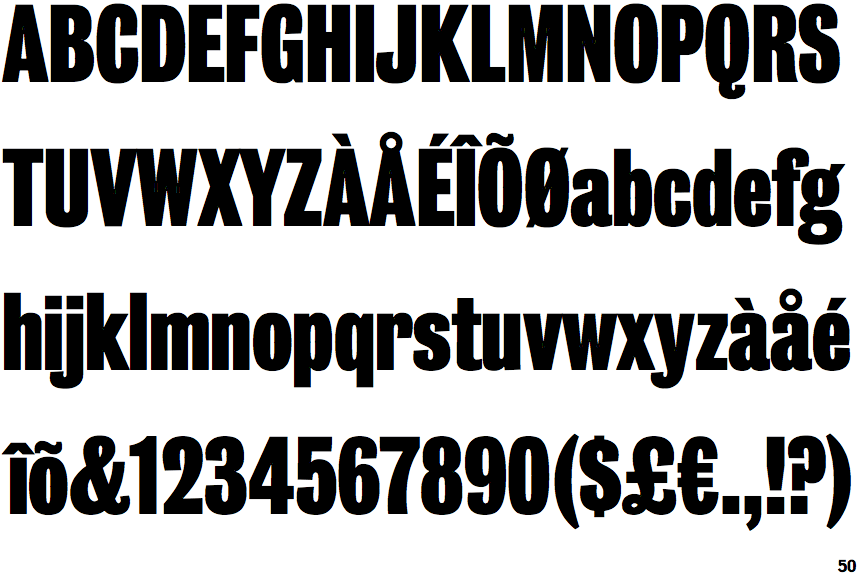
Show ExamplesBureau Grot Compressed Black
 |
The dot on the '?' (question-mark) is square or rectangular.
|
 |
The verticals of the upper-case 'M' are parallel.
|
 |
The top storey of the '3' is a sharp angle.
|
 |
The lower-case 'g' is double-storey (with or without gap).
|
 |
The upper-case 'G' has a spur/tail.
|
 |
The upper-case 'G' has a bar to the left.
|
 |
The 'l' (lower-case 'L') has no serifs or tail.
|
 |
The leg of the upper-case 'R' is curved outwards.
|
 |
The top of the lower-case 'q' has a vertical or slightly angled spur (pointed or flat).
|
 |
The dot on the lower-case 'i' or 'j' is square or rectangular.
|

