Identifont

Fonts by Appearance

Fonts by Name

Fonts by Similarity

Fonts by Picture

Fonts by Designer/Publisher

Differences

TweetTweet Differences

Compare: and  

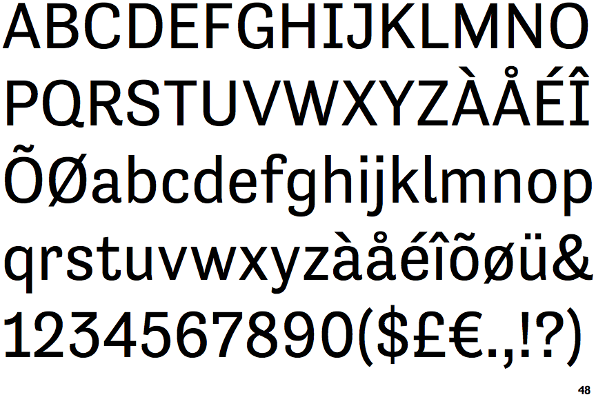
Tenso

Tenso

Angled
The top storey of the '3' is a sharp angle.
1-Storey
The lower-case 'g' is single-storey (with or without loop).
Right
The 'l' (lower-case 'L') has a right-facing lower serif or tail.
Single-bar
The upper-case 'J' has a bar to the left.
Serifs
The upper-case letter 'I' has serifs/bars.

Note that the fonts in the icons shown above represent general examples, not necessarily the two fonts chosen for comparison.

Show Examples
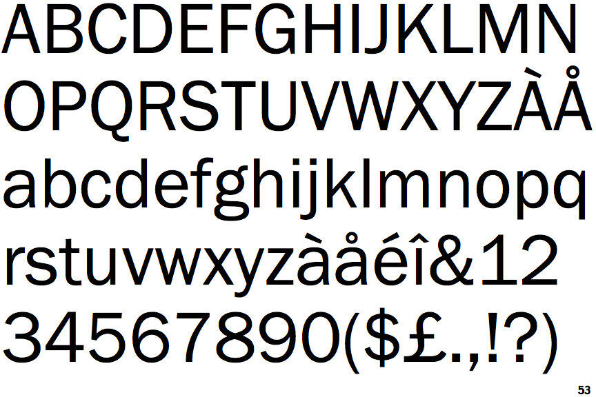
ITC Franklin Gothic

ITC Franklin Gothic

Round
The top storey of the '3' is a smooth curve.
2-Storey
The lower-case 'g' is double-storey (with or without gap).
Plain
The 'l' (lower-case 'L') has no serifs or tail.
Plain
The upper-case 'J' has no bar.
Plain
The upper-case letter 'I' is plain.