Identifont

Fonts by Appearance

Fonts by Name

Fonts by Similarity

Fonts by Picture

Fonts by Designer/Publisher

Differences

TweetTweet Differences

Compare: and  

Telepod Two SG

Telepod Two SG

Gap top
The '&' (ampersand) looks like 'Et' with a gap at the top.
Double
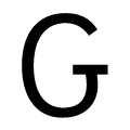
The upper-case 'G' has double-sided bar.
Double-bar
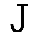
The upper-case 'J' has a bar both sides.
Parallel
The upper-case 'A' has parallel verticals.
Straight
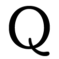
The tail of the upper-case 'Q' is straight.

Note that the fonts in the icons shown above represent general examples, not necessarily the two fonts chosen for comparison.

Show Examples
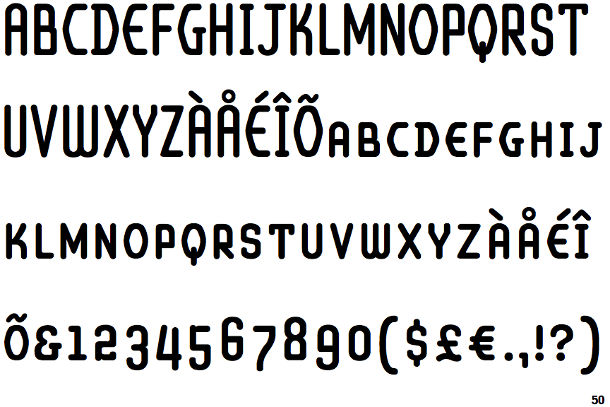
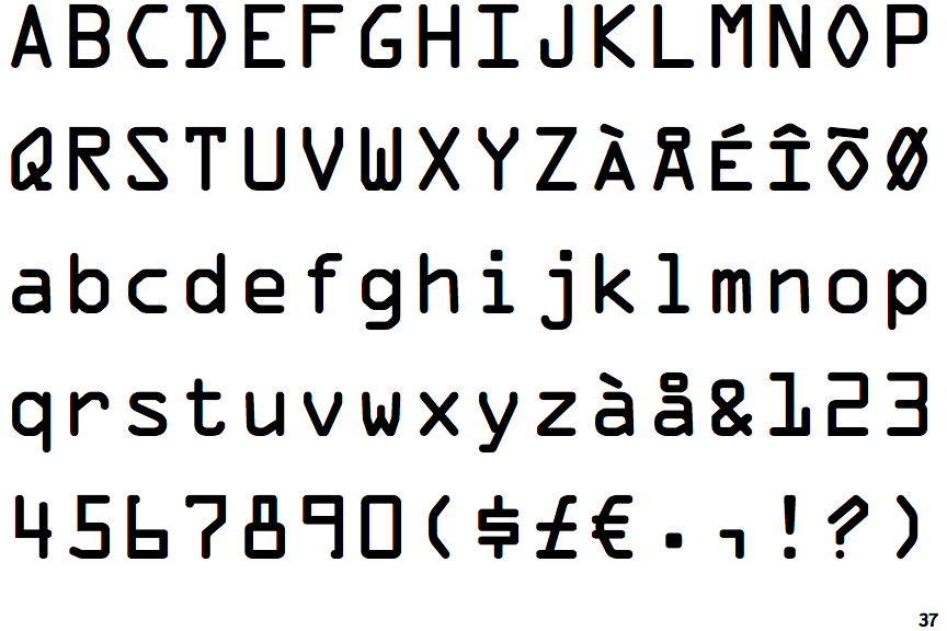
OCR-A

OCR-A

Closed
The '&' (ampersand) is traditional style with two enclosed loops.
Left
The upper-case 'G' has a bar to the left.
Plain
The upper-case 'J' has no bar.
Tapered
The upper-case 'A' has tapered verticals.
Curved
The tail of the upper-case 'Q' is curved or S-shaped.