 |
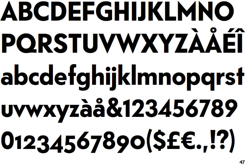
The upper-case 'Q' tail touches the circle.
|
 |
The '$' (dollar) has a single line which does not cross the 'S'.
|
 |
The centre vertex of the upper-case 'M' is above the baseline.
|
 |
The verticals of the upper-case 'M' are parallel.
|
 |
The right side of the upper-case 'G' has a flat section.
|
 |
The lower-case 'u' has no stem/serif.
|
 |
The ends of the upper-case 'C' stroke are vertical or nearly vertical.
|
Note that the fonts in the icons shown above represent general examples, not necessarily the two fonts chosen for comparison.
Show Examples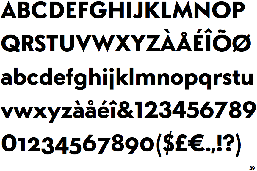
 |
The upper-case 'Q' tail crosses the circle.
|
 |
The '$' (dollar) has a single line crossing the 'S'.
|
|
The centre vertex of the upper-case 'M' is on the baseline.
|
 |
The verticals of the upper-case 'M' are sloping.
|
 |
The right side of the upper-case 'G' is curved.
|
 |
The lower-case 'u' has a stem/serif.
|
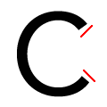 |
The ends of the upper-case 'C' stroke are angled.
|