 |
The upper-case 'Q' tail touches the circle.
|
 |
The '&' (ampersand) looks like 'Et' with a gap at the top.
|
 |
The upper-case 'J' sits on the baseline.
|
 |
The top stroke of the upper-case 'C' has no upward-pointing serif.
|
 |
The foot of the '4' has no serifs.
|
 |
The centre vertex of the upper-case 'W' has no serifs.
|
 |
The upper-case 'C' is symmetrical about a horizontal axis.
|
 |
The lower-case 't' has double-sided bar which forms a right-angle with the vertical.
|
 |
The foot of the '£' (pound) has no loop.
|
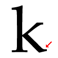 |
The leg of the lower-case 'k' has single right-pointing lower serif or foot.
|
Note that the fonts in the icons shown above represent general examples, not necessarily the two fonts chosen for comparison.
Show Examples
 |
The upper-case 'Q' tail crosses the circle.
|
 |
The '&' (ampersand) is traditional style with two enclosed loops.
|
 |
The upper-case 'J' descends below the baseline.
|
 |
The top stroke of the upper-case 'C' has a vertical or angled upward-pointing serif.
|
 |
The foot of the '4' has double-sided serifs.
|
 |
The centre vertex of the upper-case 'W' has two separate serifs.
|
 |
The upper-case 'C' is asymmetrical about a horizontal axis.
|
 |
The lower-case 't' has double-sided bar which forms a diagonal with the vertical.
|
 |
The foot of the '£' (pound) has a loop.
|
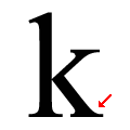 |
The leg of the lower-case 'k' has two lower serifs.
|