 |
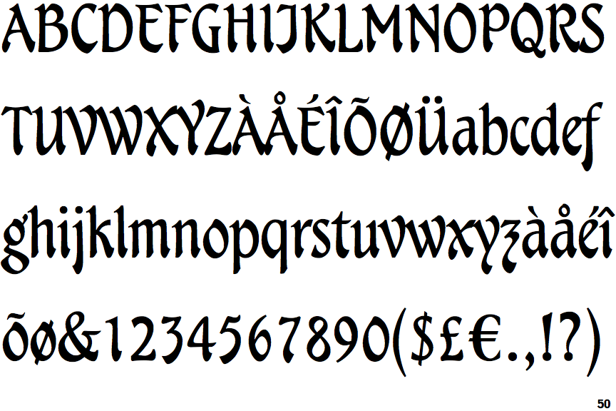
The upper-case 'Q' tail crosses the circle.
|
 |
The centre vertex of the upper-case 'M' is above the baseline.
|
 |
The verticals of the upper-case 'M' are parallel.
|
 |
The top storey of the '3' is a sharp angle.
|
 |
The top of the upper-case 'A' has a serif or cusp on the left.
|
 |
The leg of the upper-case 'R' is curved inwards.
|
 |
The centre bar of the upper-case 'R' meets the vertical.
|
 |
The tail of the lower-case 'f' descends below the baseline.
|
Note that the fonts in the icons shown above represent general examples, not necessarily the two fonts chosen for comparison.
Show Examples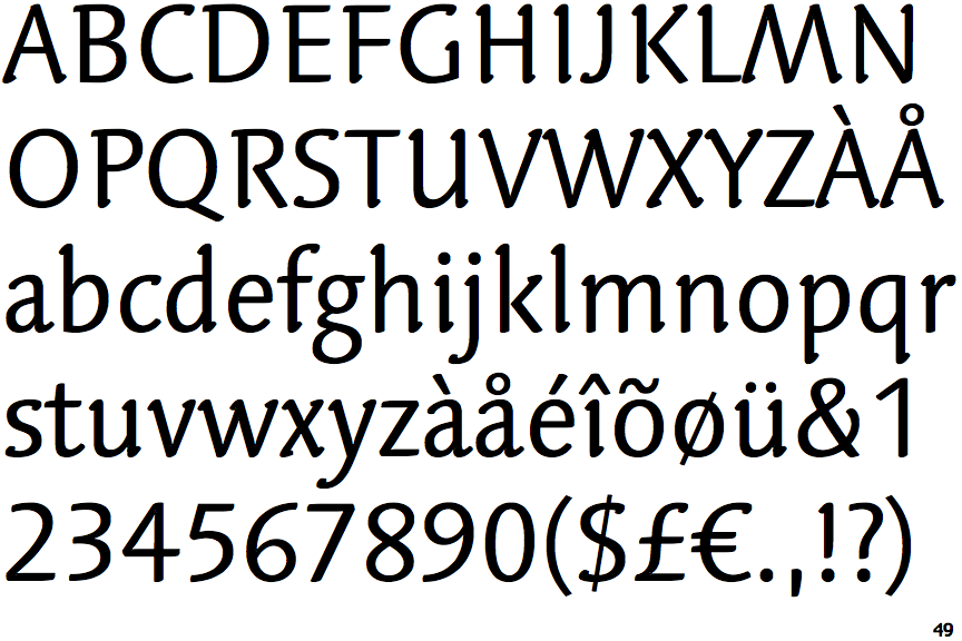
 |
The upper-case 'Q' tail touches the circle.
|
|
The centre vertex of the upper-case 'M' is on the baseline.
|
 |
The verticals of the upper-case 'M' are sloping.
|
 |
The top storey of the '3' is a smooth curve.
|
 |
The top of the upper-case 'A' has no serifs or cusps.
|
 |
The leg of the upper-case 'R' is straight.
|
 |
The centre bar of the upper-case 'R' leaves a gap with the vertical.
|
 |
The tail of the lower-case 'f' sits on the baseline.
|