 |
The diagonal strokes of the upper-case 'K' meet in a 'T'.
|
 |
The centre vertex of the upper-case 'M' is above the baseline.
|
 |
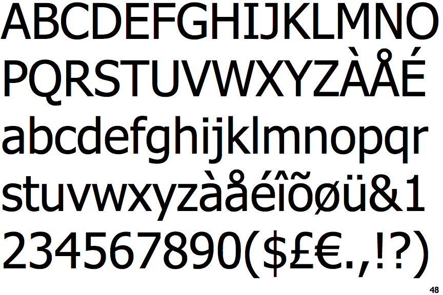
The upper-case 'J' has a bar to the left.
|
 |
The leg of the upper-case 'R' is straight.
|
 |
The tail of the upper-case 'Q' is curved, S-shaped, or Z-shaped.
|
 |
The tail of the lower-case 'y' is substantially straight.
|
 |
The '1' (digit one) has double-sided base or serifs.
|
 |
The upper-case letter 'I' has serifs/bars.
|
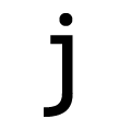 |
The tail of the lower-case 'j' is curved with an upper serif.
|
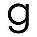 |
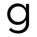
The bowl of the lower-case 'g' is a flattened circle or ellipse or ellipse.
|
There are more than ten differences; only the first ten are shown.
Note that the fonts in the icons shown above represent general examples, not necessarily the two fonts chosen for comparison.
Show Examples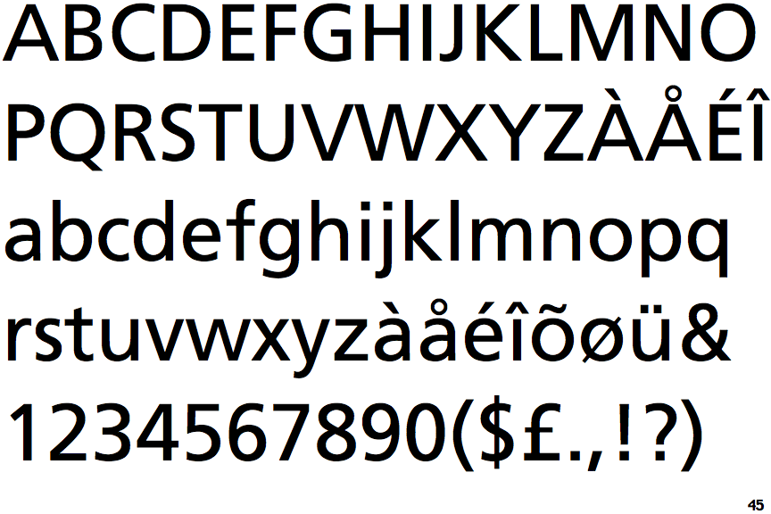
 |
The diagonal strokes of the upper-case 'K' meet at the vertical (with or without a gap).
|
 |
The centre vertex of the upper-case 'M' is on the baseline.
|
 |
The upper-case 'J' has no bar.
|
 |
The leg of the upper-case 'R' is curved outwards.
|
 |
The tail of the upper-case 'Q' is straight (horizontal, diagonal, or vertical).
|
 |
The tail of the lower-case 'y' is curved or U-shaped to the left.
|
 |
The '1' (digit one) has no base.
|
 |
The upper-case letter 'I' is plain.
|
 |
The tail of the lower-case 'j' is curved with no upper serif.
|
 |
The bowl of the lower-case 'g' is a circle or ellipse or ellipse.
|