Identifont

Fonts by Appearance

Fonts by Name

Fonts by Similarity

Fonts by Picture

Fonts by Designer/Publisher

Differences

TweetTweet Differences

Compare: and  

Tablet Gothic Semi Condensed Heavy

Tablet Gothic Semi Condensed Heavy

Open
The '&' (ampersand) is traditional style with a gap at the top.
Spur
The upper-case 'G' has a spur/tail.
Square/rectangle
The dot on the lower-case 'i' or 'j' is square or rectangular.
Serifs
The upper-case letter 'I' has serifs/bars.
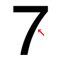
Concave
The stem of the '7' is curved inwards.

Note that the fonts in the icons shown above represent general examples, not necessarily the two fonts chosen for comparison.

Show Examples
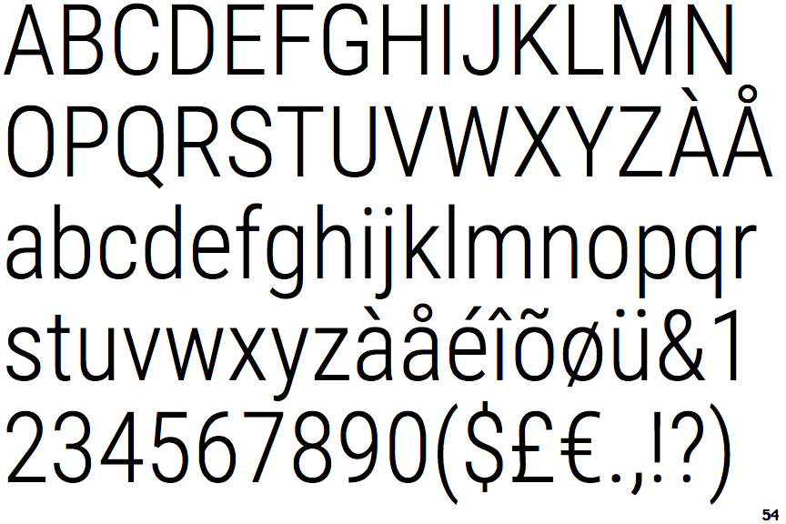
Roboto Condensed Light

Roboto Condensed Light

Closed
The '&' (ampersand) is traditional style with two enclosed loops.
No spur
The upper-case 'G' has no spur/tail.
Circle
The dot on the lower-case 'i' or 'j' is circular or oval.
Plain
The upper-case letter 'I' is plain.
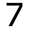
Straight
The stem of the '7' is straight.