 |
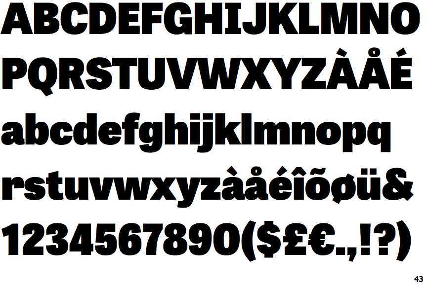
The upper-case 'Q' tail touches the circle.
|
 |
The '&' (ampersand) is traditional style with a gap at the top.
|
 |
The dot on the '?' (question-mark) is square or rectangular.
|
 |
The lower-case 'g' is single-storey (with or without loop).
|
 |
The dot on the lower-case 'i' or 'j' is square or rectangular.
|
 |
The upper-case letter 'I' has serifs/bars.
|
 |
The stem of the '7' is curved inwards.
|
Note that the fonts in the icons shown above represent general examples, not necessarily the two fonts chosen for comparison.
Show Examples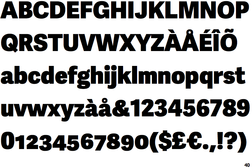
 |
The upper-case 'Q' tail crosses the circle.
|
 |
The '&' (ampersand) is traditional style with two enclosed loops.
|
 |
The dot on the '?' (question-mark) is circular or oval.
|
 |
The lower-case 'g' is double-storey (with or without gap).
|
 |
The dot on the lower-case 'i' or 'j' is circular or oval.
|
 |
The upper-case letter 'I' is plain.
|
 |
The stem of the '7' is straight.
|