 |
The upper-case 'J' sits on the baseline.
|
 |
The dot on the '?' (question-mark) is circular or oval.
|
 |
The verticals of the upper-case 'M' are sloping.
|
 |
The top stroke of the upper-case 'C' has no upward-pointing serif.
|
 |
The centre bar of the upper-case 'E' has no serifs.
|
 |
The foot of the '4' has no serifs.
|
 |
The centre vertex of the upper-case 'W' has no serifs.
|
 |
The lower-case 'e' has a straight horizontal bar.
|
 |
The top of the '7' has a downward-pointing serif or bar.
|
 |
The centre bar of the upper-case 'F' has no serifs.
|
There are more than ten differences; only the first ten are shown.
Note that the fonts in the icons shown above represent general examples, not necessarily the two fonts chosen for comparison.
Show Examples
 |
The upper-case 'J' descends below the baseline.
|
 |
The dot on the '?' (question-mark) is diamond-shaped or triangular.
|
 |
The verticals of the upper-case 'M' are parallel.
|
 |
The top stroke of the upper-case 'C' has a vertical or angled upward-pointing serif.
|
 |
The centre bar of the upper-case 'E' has serifs.
|
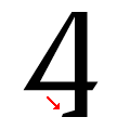 |
The foot of the '4' has a single left-facing serif.
|
 |
The centre vertex of the upper-case 'W' has two separate serifs.
|
 |
The lower-case 'e' has a straight angled bar.
|
 |
The top of the '7' has no serif or bar.
|
 |
The centre bar of the upper-case 'F' has serifs.
|