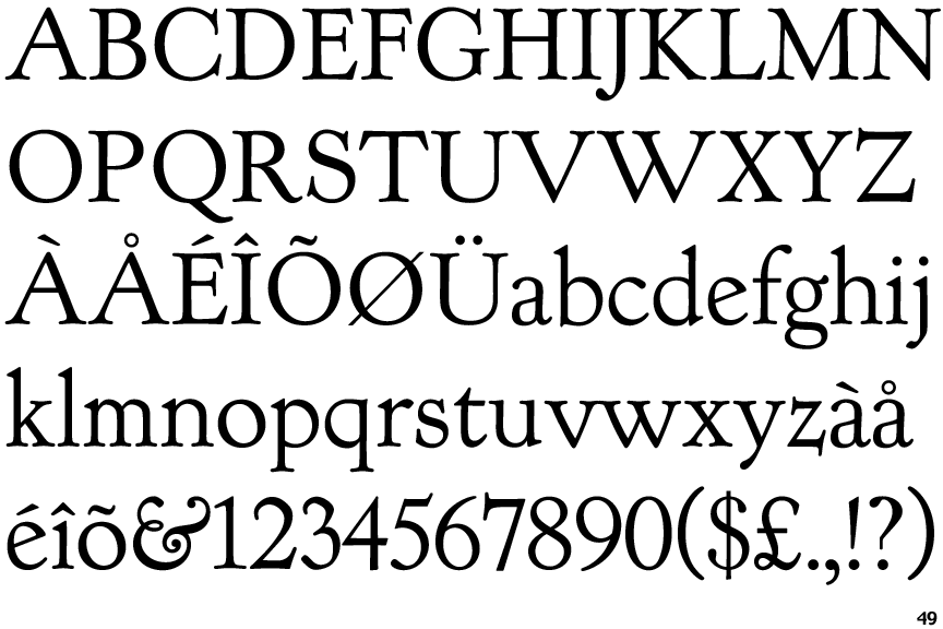
 |
The '&' (ampersand) looks like 'Et' with a gap at the top.
|
 |
The dot on the '?' (question-mark) is circular or oval.
|
 |
The centre bar of the upper-case 'P' meets the vertical.
|
 |
The upper-case 'G' foot has a downward pointing spur.
|
 |
The top of the upper-case 'W' has three upper terminals.
|
 |
The tail of the upper-case 'J' has a rounded end or ball.
|
 |
The lower-case 'e' has a straight angled bar.
|
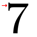 |
The top of the '7' has a double-sided serif or bar.
|
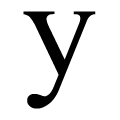 |
The tail of the lower-case 'y' is curved with a rounded end or ball.
|
 |
The tail of the upper-case 'Q' is single-sided.
|
Note that the fonts in the icons shown above represent general examples, not necessarily the two fonts chosen for comparison.
Show Examples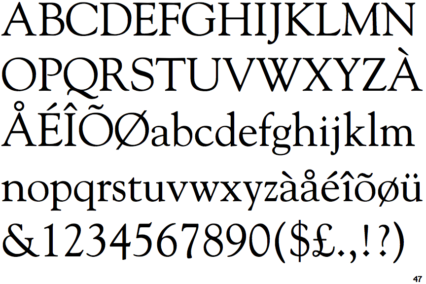
 |
The '&' (ampersand) is traditional style with a gap at the top.
|
 |
The dot on the '?' (question-mark) is diamond-shaped or triangular.
|
 |
The centre bar of the upper-case 'P' leaves a gap with the vertical.
|
 |
The upper-case 'G' foot has no spur or serif.
|
 |
The top of the upper-case 'W' has four upper terminals.
|
 |
The tail of the upper-case 'J' has a flat end or cusp.
|
 |
The lower-case 'e' has a straight horizontal bar.
|
 |
The top of the '7' has a downward-pointing serif or bar.
|
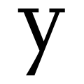 |
The tail of the lower-case 'y' is straight or pointed.
|
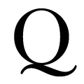 |
The tail of the upper-case 'Q' is double-sided.
|