 |
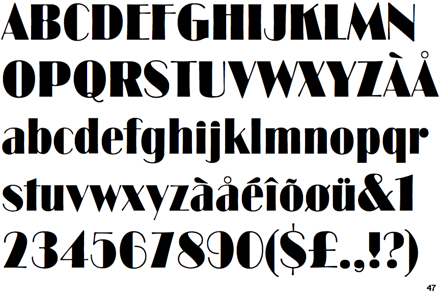
The '$' (dollar) has a single line which does not cross the 'S'.
|
 |
The diagonal strokes of the upper-case 'K' meet at the vertical (with or without a gap).
|
 |
The upper-case 'G' has a bar to the left.
|
 |
The upper-case 'Y' arms and tail are separate strokes.
|
 |
The leg of the upper-case 'R' is straight.
|
 |
The lower-case 'u' has a stem/serif.
|
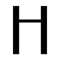 |
The bar of the upper-case 'H' is above centre.
|
 |
The tail of the lower-case 'f' sits on the baseline.
|
Note that the fonts in the icons shown above represent general examples, not necessarily the two fonts chosen for comparison.
Show Examples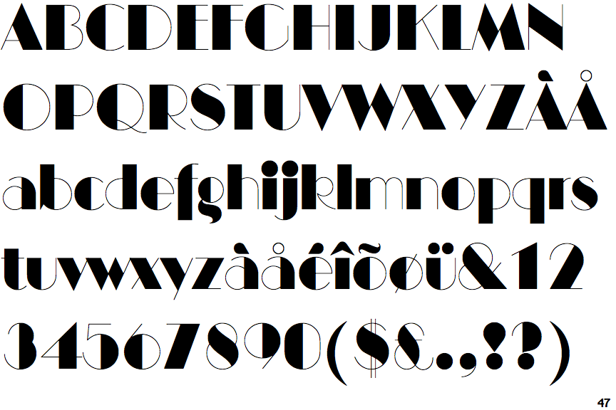
 |
The '$' (dollar) has a double line crossing the 'S'.
|
 |
The diagonal strokes of the upper-case 'K' meet in a 'T'.
|
 |
The upper-case 'G' has no bar.
|
 |
The upper-case 'Y' right-hand arm forms a continuous stroke with the tail.
|
 |
The leg of the upper-case 'R' is curved inwards.
|
 |
The lower-case 'u' has no stem/serif.
|
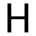 |
The bar of the upper-case 'H' is vertically central.
|
 |
The tail of the lower-case 'f' descends below the baseline.
|