 |
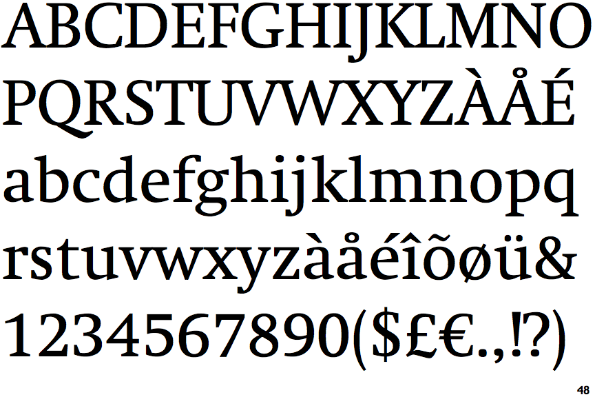
The '$' (dollar) has a single line crossing the 'S'.
|
 |
The verticals of the upper-case 'M' are parallel.
|
 |
The lower-case 'g' is double-storey (with or without gap).
|
 |
The lower-case 'a' stem curves over the top of the bowl (double storey).
|
 |
The top of the upper-case 'A' has no serifs or cusps.
|
 |
The top of the upper-case 'W' has three upper terminals.
|
 |
The foot of the '4' has double-sided serifs.
|
 |
The tail of the upper-case 'J' has a flat end or cusp.
|
 |
The sides of the lower-case 'y' are angled (V-shaped).
|
 |
The junction of the upper-case 'K' leaves a visible gap with the vertical.
|
There are more than ten differences; only the first ten are shown.
Note that the fonts in the icons shown above represent general examples, not necessarily the two fonts chosen for comparison.
Show Examples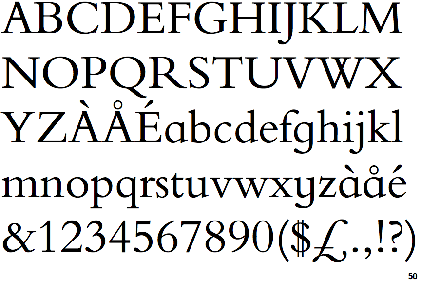
 |
The '$' (dollar) has a double line crossing the 'S'.
|
 |
The verticals of the upper-case 'M' are sloping.
|
 |
The lower-case 'g' is single-storey (with or without loop).
|
 |
The lower-case 'a' stem stops at the top of the bowl (single storey).
|
 |
The top of the upper-case 'A' has a serif or cusp on the left.
|
 |
The top of the upper-case 'W' has four upper terminals.
|
 |
The foot of the '4' has no serifs.
|
 |
The tail of the upper-case 'J' has a rounded end or ball.
|
 |
The sides of the lower-case 'y' are parallel (U-shaped).
|
 |
The junction of the upper-case 'K' touches the vertical.
|