 |
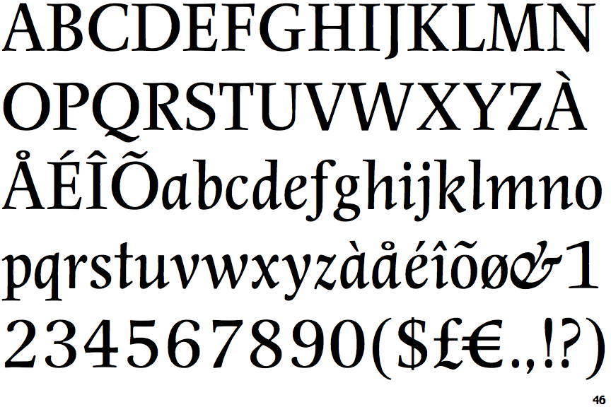
The upper-case 'Q' tail touches the circle.
|
 |
The '4' is closed.
|
 |
The centre bar of the upper-case 'P' leaves a gap with the vertical.
|
 |
The lower-case 'g' is double-storey (with or without gap).
|
 |
The centre bar of the upper-case 'R' leaves a gap with the vertical.
|
 |
The top of the upper-case 'W' has three upper terminals.
|
 |
The bar of the upper-case 'G' is double-sided.
|
 |
The tail of the lower-case 'f' descends below the baseline.
|
Note that the fonts in the icons shown above represent general examples, not necessarily the two fonts chosen for comparison.
Show Examples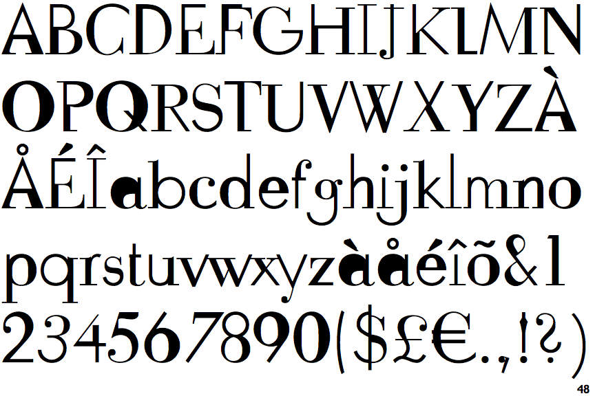
 |
The upper-case 'Q' tail crosses the circle.
|
 |
The '4' is open.
|
 |
The centre bar of the upper-case 'P' meets the vertical.
|
 |
The lower-case 'g' is single-storey (with or without loop).
|
 |
The centre bar of the upper-case 'R' meets the vertical.
|
 |
The top of the upper-case 'W' has four upper terminals.
|
 |
The bar of the upper-case 'G' is single-sided, left-facing.
|
 |
The tail of the lower-case 'f' sits on the baseline.
|