 |
The upper-case 'Q' tail touches the circle.
|
 |
The '&' (ampersand) looks like 'Et' with a gap at the top.
|
 |
The lower-case 'g' is double-storey (with or without gap).
|
 |
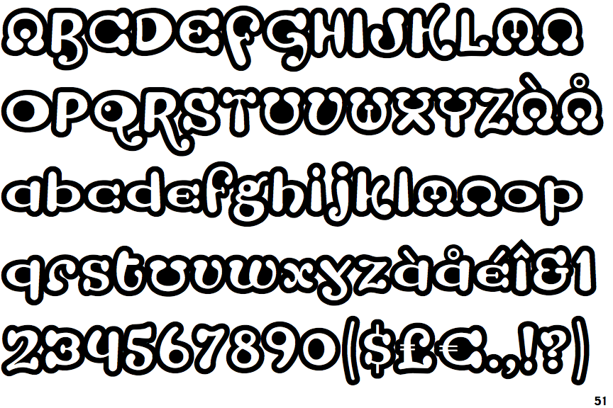
The characters are outlined, shaded, or filled with a pattern.
|
 |
The upper-case 'Y' arms and tail are separate strokes.
|
 |
The 'l' (lower-case 'L') has no serifs or tail.
|
 |
The upper-case 'E' is drawn as a 'C' with a bar.
|
 |
The centre bar of the upper-case 'R' meets the vertical.
|
 |
The centre strokes of the upper-case 'W' form one centre stroke.
|
Note that the fonts in the icons shown above represent general examples, not necessarily the two fonts chosen for comparison.
Show Examples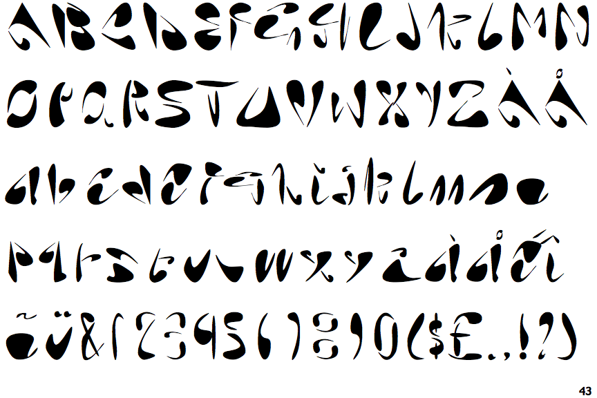
 |
The upper-case 'Q' tail is below and separated from the circle.
|
 |
The '&' (ampersand) is traditional style with two enclosed loops.
|
 |
The lower-case 'g' is single-storey (with or without loop).
|
 |
The characters are solid.
|
 |
The upper-case 'Y' right-hand arm forms a continuous stroke with the tail.
|
 |
The 'l' (lower-case 'L') has a right-facing lower serif or tail.
|
 |
The upper-case 'E' is drawn as a single stroke (with or without loop).
|
 |
The centre bar of the upper-case 'R' leaves a gap with the vertical.
|
 |
The centre strokes of the upper-case 'W' meet at a vertex.
|