 |
The upper-case 'Q' tail crosses the circle.
|
 |
The '$' (dollar) has a double line crossing the 'S'.
|
 |
The top storey of the '3' is a sharp angle.
|
 |
The upper-case 'A' has tapered verticals.
|
 |
The strokes are sloped right (italic, oblique, or cursive).
|
 |
The upper-case 'L' has one lower loop only.
|
 |
The upper-case 'A' right-hand vertical loops to form the bar.
|
Note that the fonts in the icons shown above represent general examples, not necessarily the two fonts chosen for comparison.
Show Examples
 |
The upper-case 'Q' tail forms part of the stroke of an open circle.
|
 |
The '$' (dollar) has a single line crossing the 'S'.
|
 |
The top storey of the '3' is a smooth curve.
|
 |
The upper-case 'A' is drawn like a lower-case 'a'.
|
 |
The strokes are upright.
|
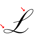 |
The upper-case 'L' has one upper and one lower loop.
|
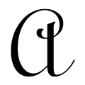 |
The upper-case 'A' is drawn like a lower-case 'a'.
|