 |
The upper-case 'Q' tail touches the circle.
|
 |
The top of the lower-case 'q' has a vertical or slightly angled spur (pointed or flat).
|
 |
The lower-case 'u' has a stem/serif.
|
 |
The '1' (digit one) has no base.
|
 |
The upper-case letter 'I' is plain.
|
 |
The tail of the lower-case 't' is curved.
|
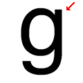 |
The lower-case 'g' has a vertical spur.
|
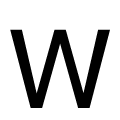 |
The centre vertex of the upper-case 'W' is level with the outer strokes.
|
Note that the fonts in the icons shown above represent general examples, not necessarily the two fonts chosen for comparison.
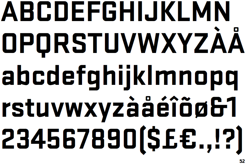
Show Examples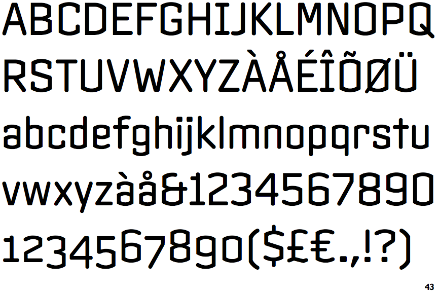
 |
The upper-case 'Q' tail crosses the circle.
|
 |
The top of the lower-case 'q' has no spur or serif.
|
 |
The lower-case 'u' has no stem/serif.
|
 |
The '1' (digit one) has double-sided base or serifs.
|
 |
The upper-case letter 'I' has serifs/bars.
|
 |
The tail of the lower-case 't' is straight.
|
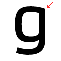 |
The lower-case 'g' has no spur or serif.
|
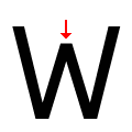 |
The centre vertex of the upper-case 'W' is below the outer strokes.
|