Identifont

Fonts by Appearance

Fonts by Name

Fonts by Similarity

Fonts by Picture

Fonts by Designer/Publisher

Differences

TweetTweet Differences

Compare: and  

Starling

Starling

On
The upper-case 'J' sits on the baseline.
Single
The diagonal strokes of the upper-case 'K' meet at the vertical (with or without a gap).
Top serif
The top stroke of the upper-case 'C' has a vertical or angled upward-pointing serif.

Note that the fonts in the icons shown above represent general examples, not necessarily the two fonts chosen for comparison.

Show Examples
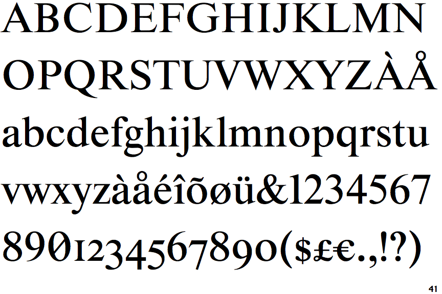
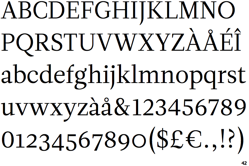
Leitura Roman 1

Leitura Roman 1

Below
The upper-case 'J' descends below the baseline.
Bar
The diagonal strokes of the upper-case 'K' connect to the vertical via a horizontal bar.
No top serif
The top stroke of the upper-case 'C' has no upward-pointing serif.