Identifont

Fonts by Appearance

Fonts by Name

Fonts by Similarity

Fonts by Picture

Fonts by Designer/Publisher

Differences

TweetTweet Differences

Compare: and  

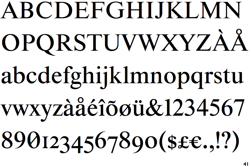
Starling

Starling

On
The upper-case 'J' sits on the baseline.
Parallel
The verticals of the upper-case 'M' are parallel.
Top serif
The top stroke of the upper-case 'C' has a vertical or angled upward-pointing serif.
Three
The top of the upper-case 'W' has three upper terminals.
Horizontal
The lower-case 'e' has a straight horizontal bar.

Note that the fonts in the icons shown above represent general examples, not necessarily the two fonts chosen for comparison.

Show Examples
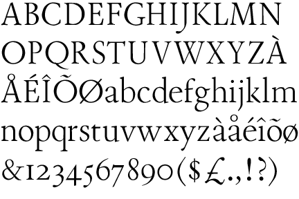
JY Tranquility

JY Tranquility

Below
The upper-case 'J' descends below the baseline.
Sloping
The verticals of the upper-case 'M' are sloping.
No top serif
The top stroke of the upper-case 'C' has no upward-pointing serif.
Four
The top of the upper-case 'W' has four upper terminals.
Sloping
The lower-case 'e' has a straight angled bar.