 |
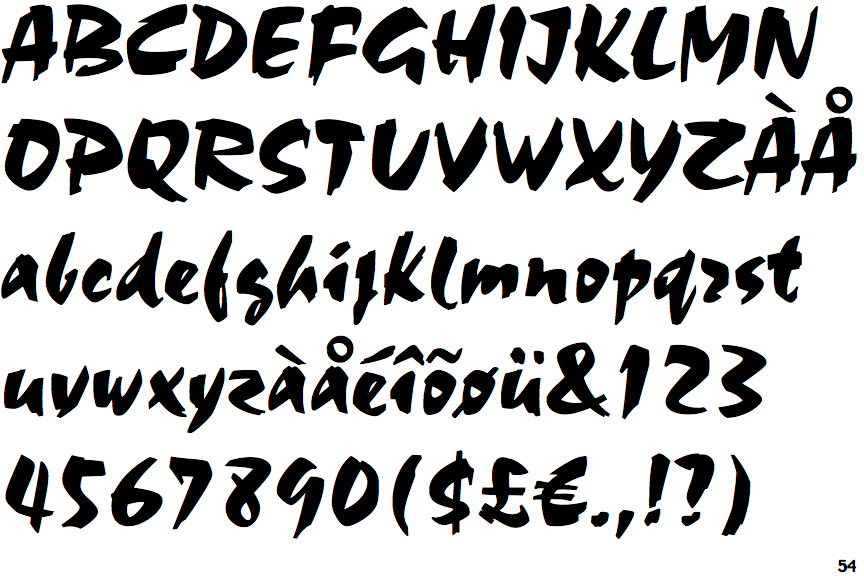
The '&' (ampersand) is traditional style with two enclosed loops.
|
 |
The '4' is open.
|
 |
The centre bar of the upper-case 'P' crosses the vertical.
|
 |
The upper-case 'U' has no stem/serif.
|
 |
The upper-case 'G' has a spur/tail.
|
 |
The upper-case 'G' has no bar.
|
 |
The upper-case 'J' has a bar to the left.
|
 |
The upper-case 'A' has tapered verticals.
|
 |
The centre bar of the upper-case 'R' meets the vertical.
|
 |
The upper-case 'A' bar is drawn as a separate stroke and no flourish on top.
|
There are more than ten differences; only the first ten are shown.
Note that the fonts in the icons shown above represent general examples, not necessarily the two fonts chosen for comparison.
Show Examples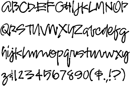
 |
The '&' (ampersand) looks like an 'E' with a solid or broken line.
|
 |
The '4' is closed.
|
 |
The centre bar of the upper-case 'P' leaves a gap with the vertical.
|
 |
The upper-case 'U' has a stem/serif.
|
|
The upper-case 'G' has no spur/tail.
|
 |
The upper-case 'G' has double-sided bar.
|
 |
The upper-case 'J' has no bar.
|
 |
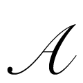
The upper-case 'A' is drawn like a lower-case 'a'.
|
 |
The centre bar of the upper-case 'R' leaves a gap with the vertical.
|
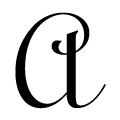 |
The upper-case 'A' is drawn like a lower-case 'a'.
|