Differences
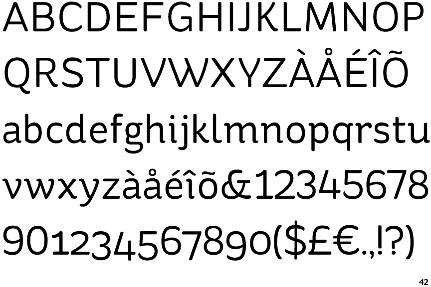
St Ryde
 |
The '$' (dollar) has a single line crossing the 'S'.
|
 |
The '&' (ampersand) is traditional style with a gap at the top.
|
 |
The '4' is open.
|
 |
The verticals of the upper-case 'M' are sloping.
|
 |
The upper-case 'G' has a spur/tail.
|
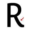 |
The leg of the upper-case 'R' is curved inwards.
|
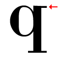 |
The top of the lower-case 'q' has a right-facing serif.
|
 |
The lower storey of the lower-case 'g' has a gap.
|
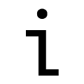 |
The lower-case 'i' has a left-facing upper serif and right-facing lower serif or tail.
|
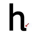 |
The lower-case 'h' has an exit stroke.
|
There are more than ten differences; only the first ten are shown.
Note that the fonts in the icons shown above represent general examples, not necessarily the two fonts chosen for comparison.
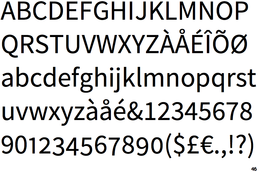
Show ExamplesSource Sans
 |
The '$' (dollar) has a single line which does not cross the 'S'.
|
 |
The '&' (ampersand) is traditional style with two enclosed loops.
|
 |
The '4' is closed.
|
 |
The verticals of the upper-case 'M' are parallel.
|
 |
The upper-case 'G' has no spur/tail.
|
 |
The leg of the upper-case 'R' is straight.
|
 |
The top of the lower-case 'q' has a vertical or slightly angled spur (pointed or flat).
|
 |
The lower storey of the lower-case 'g' has no gap.
|
 |
The lower-case 'i' has no serifs or tail.
|
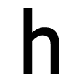 |
The lower-case 'h' has no exit stroke.
|
