 |
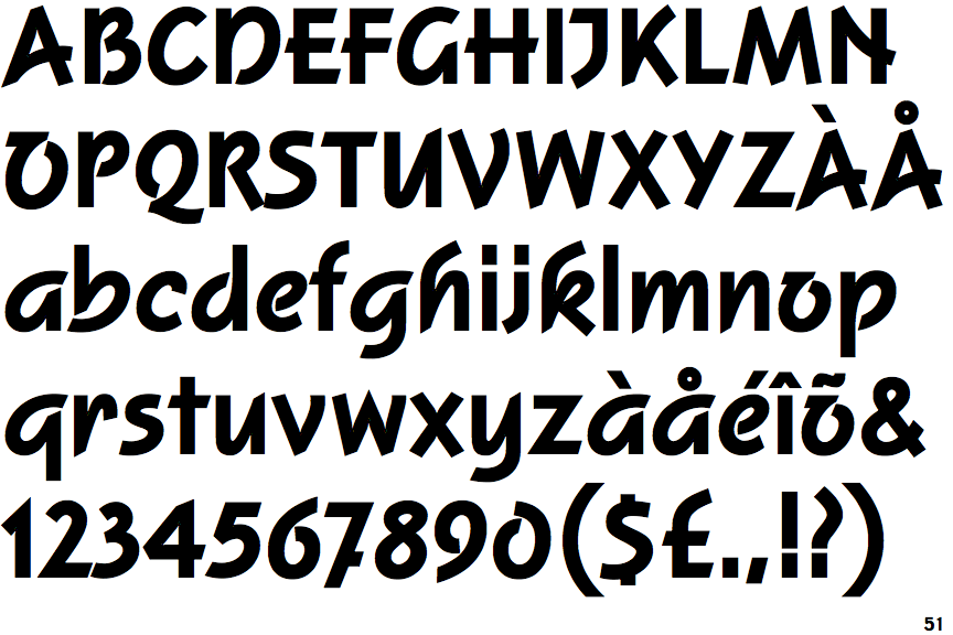
The upper-case 'J' sits on the baseline.
|
 |
The dot on the '?' (question-mark) is square or rectangular.
|
 |
The centre bar of the upper-case 'P' leaves a gap with the vertical.
|
 |
The 'l' (lower-case 'L') has no serifs or tail.
|
 |
The leg of the upper-case 'R' is straight.
|
 |
The upper-case 'E' is normal letter shape.
|
 |
The strokes are upright.
|
 |
The dot on the lower-case 'i' or 'j' is square or rectangular.
|
 |
The lower-case 'i' has no serifs or tail.
|
 |
The tail of the lower-case 'f' sits on the baseline.
|
Note that the fonts in the icons shown above represent general examples, not necessarily the two fonts chosen for comparison.
Show Examples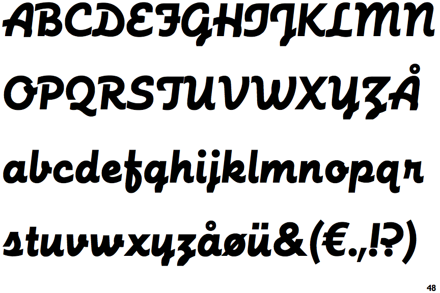
 |
The upper-case 'J' descends below the baseline.
|
 |
The dot on the '?' (question-mark) is circular or oval.
|
 |
The centre bar of the upper-case 'P' meets the vertical.
|
 |
The 'l' (lower-case 'L') has a right-facing lower serif or tail.
|
 |
The leg of the upper-case 'R' is curved inwards.
|
 |
The upper-case 'E' is drawn as a single stroke (with or without loop).
|
 |
The strokes are sloped right (italic, oblique, or cursive).
|
 |
The dot on the lower-case 'i' or 'j' is circular or oval.
|
 |
The lower-case 'i' has a right-facing lower serif or tail.
|
 |
The tail of the lower-case 'f' descends below the baseline.
|