 |
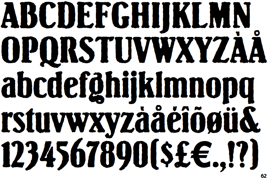
The '$' (dollar) has a single line which does not cross the 'S'.
|
 |
The '&' (ampersand) is traditional style with a gap at the top.
|
 |
The '4' is open.
|
 |
The centre vertex of the upper-case 'M' is on the baseline.
|
 |
The centre bar of the upper-case 'P' leaves a gap with the vertical.
|
 |
The top stroke of the upper-case 'C' has no upward-pointing serif.
|
 |
The centre bar of the upper-case 'R' leaves a gap with the vertical.
|
 |
The character outlines are corroded, roughened, or dirty.
|
Note that the fonts in the icons shown above represent general examples, not necessarily the two fonts chosen for comparison.
Show Examples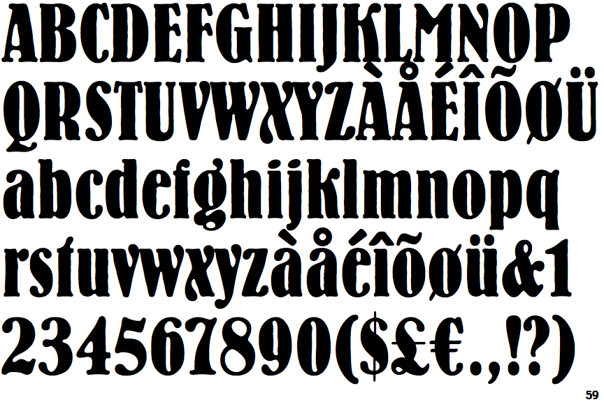
 |
The '$' (dollar) has a single line crossing the 'S'.
|
 |
The '&' (ampersand) is traditional style with two enclosed loops.
|
 |
The '4' is closed.
|
 |
The centre vertex of the upper-case 'M' is above the baseline.
|
 |
The centre bar of the upper-case 'P' meets the vertical.
|
 |
The top stroke of the upper-case 'C' has a vertical or angled upward-pointing serif.
|
 |
The centre bar of the upper-case 'R' meets the vertical.
|
 |
The character outlines are smooth/sharp.
|