 |
The upper-case 'Q' tail is below and separated from the circle.
|
 |
The centre bar of the upper-case 'P' leaves a gap with the vertical.
|
 |
The centre bar of the upper-case 'R' leaves a gap with the vertical.
|
 |
The bar of the upper-case 'G' is double-sided.
|
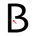 |
The centre bar of the upper-case 'B' leaves a gap with the vertical.
|
Note that the fonts in the icons shown above represent general examples, not necessarily the two fonts chosen for comparison.
Show Examples
 |
The upper-case 'Q' tail touches the circle.
|
 |
The centre bar of the upper-case 'P' meets the vertical.
|
 |
The centre bar of the upper-case 'R' meets the vertical.
|
 |
The bar of the upper-case 'G' is single-sided, left-facing.
|
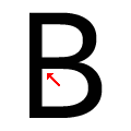 |
The centre bar of the upper-case 'B' meets the vertical.
|