 |
The upper-case 'Q' tail touches the circle.
|
 |
The top storey of the '3' is a smooth curve.
|
 |
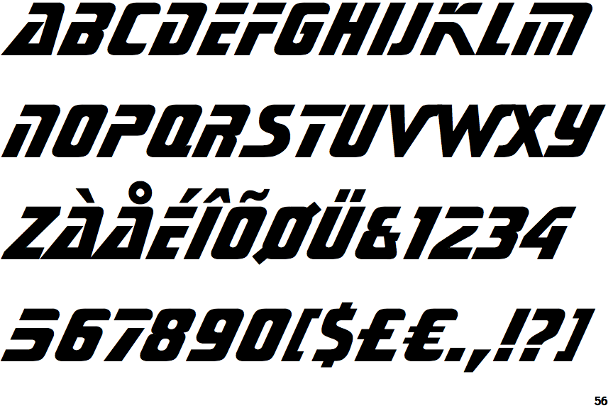
The strokes are sloped right (italic, oblique, or cursive).
|
 |
The bar of the '4' does not cross the vertical.
|
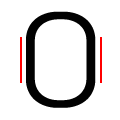 |
The verticals of the upper-case letter 'O' have straight segments.
|
 |
The verticals of the digit '0' have straight segments.
|
 |
The centre strokes of the upper-case 'W' meet at a vertex.
|
Note that the fonts in the icons shown above represent general examples, not necessarily the two fonts chosen for comparison.
Show Examples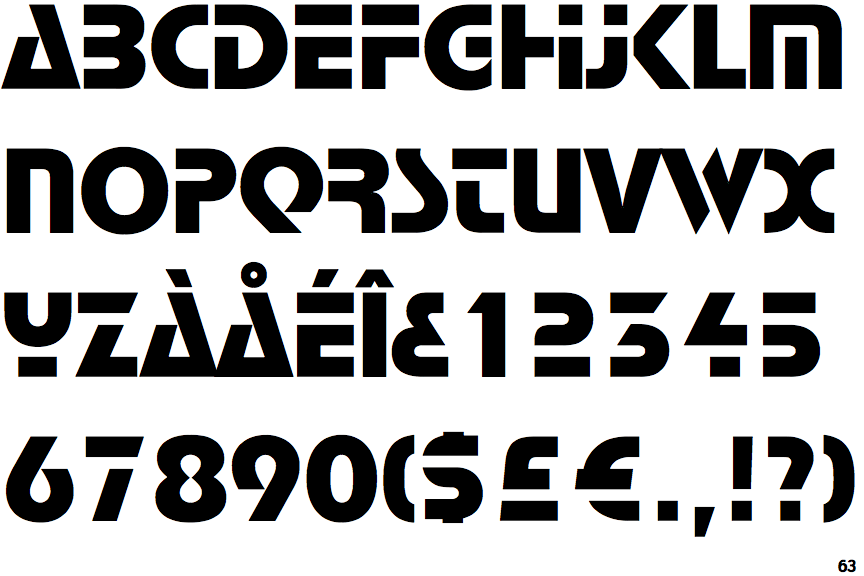
 |
The upper-case 'Q' tail forms part of the stroke of an open circle.
|
 |
The top storey of the '3' is a sharp angle.
|
 |
The strokes are upright.
|
 |
The bar of the '4' crosses the vertical.
|
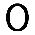 |
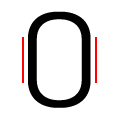
The verticals of the upper-case letter 'O' are fully curved.
|
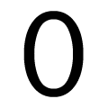 |
The verticals of the digit '0' are fully curved.
|
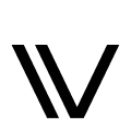 |
The centre strokes of the upper-case 'W' are separated.
|