 |
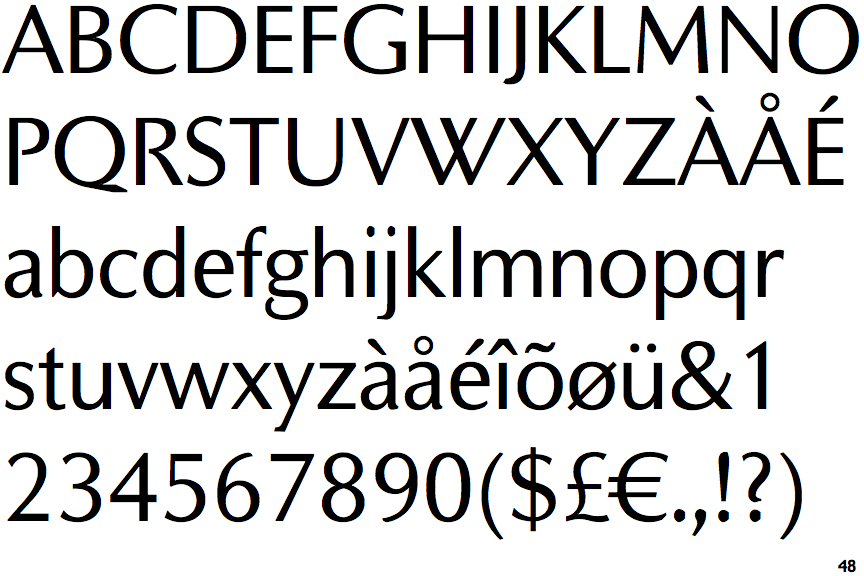
The centre vertex of the upper-case 'M' is above the baseline.
|
 |
The centre bar of the upper-case 'P' leaves a gap with the vertical.
|
 |
The upper-case 'G' has a bar to the left.
|
 |
The leg of the upper-case 'R' is curved outwards.
|
 |
The centre bar of the upper-case 'R' leaves a gap with the vertical.
|
 |
The lower storey of the lower-case 'g' has a gap.
|
 |
The top of the upper-case 'W' has four upper terminals.
|
Note that the fonts in the icons shown above represent general examples, not necessarily the two fonts chosen for comparison.
Show Examples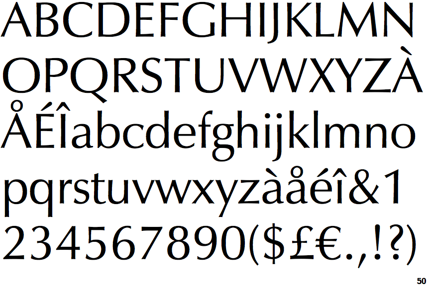
 |
The centre vertex of the upper-case 'M' is on the baseline.
|
 |
The centre bar of the upper-case 'P' meets the vertical.
|
 |
The upper-case 'G' has no bar.
|
 |
The leg of the upper-case 'R' is straight.
|
 |
The centre bar of the upper-case 'R' meets the vertical.
|
 |
The lower storey of the lower-case 'g' has no gap.
|
 |
The top of the upper-case 'W' has three upper terminals.
|