 |
The '&' (ampersand) is traditional style with two enclosed loops.
|
 |
The '4' is open.
|
 |
The diagonal strokes of the upper-case 'K' meet at the vertical (with or without a gap).
|
 |
The dot on the '?' (question-mark) is circular or oval.
|
 |
The dot on the lower-case 'i' or 'j' is circular or oval.
|
 |
The sides of the lower-case 'y' are parallel (U-shaped).
|
 |
The bar of the lower-case 'f' is single-sided.
|
 |
The bar of the '4' does not cross the vertical.
|
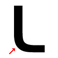 |
The foot of the upper-case 'L' is rounded.
|
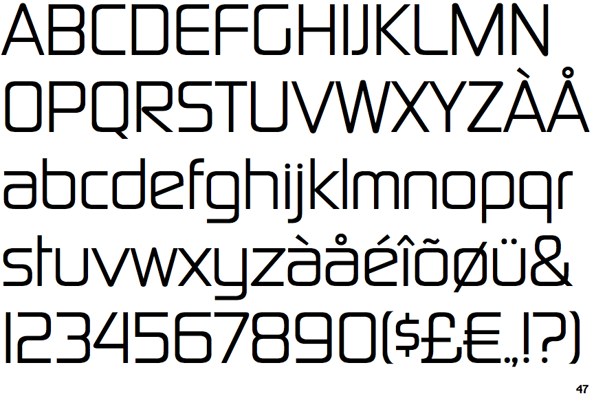
Note that the fonts in the icons shown above represent general examples, not necessarily the two fonts chosen for comparison.
Show Examples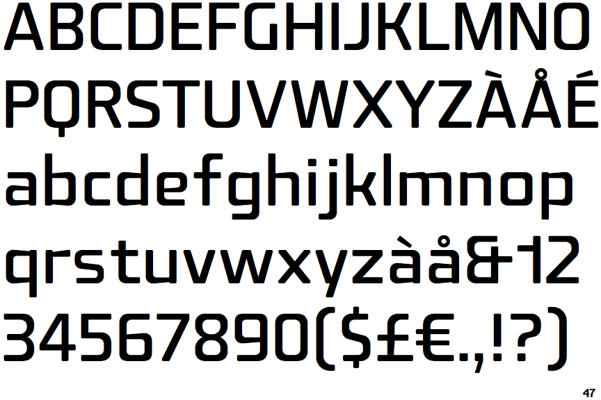
 |
The '&' (ampersand) looks like 'Et' with one enclosed loop (with or without exit stroke).
|
 |
The '4' is closed.
|
 |
The diagonal strokes of the upper-case 'K' connect to the vertical via a horizontal bar.
|
 |
The dot on the '?' (question-mark) is square or rectangular.
|
 |
The dot on the lower-case 'i' or 'j' is square or rectangular.
|
 |
The sides of the lower-case 'y' are angled (V-shaped).
|
 |
The bar of the lower-case 'f' is double-sided.
|
 |
The bar of the '4' crosses the vertical.
|
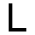 |
The foot of the upper-case 'L' is sharp.
|