 |
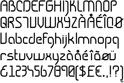
The upper-case 'J' descends below the baseline.
|
 |
The dot on the '?' (question-mark) is square or rectangular.
|
 |
The centre bar of the upper-case 'P' leaves a gap with the vertical.
|
 |
The lower-case 'a' stem stops at the top of the bowl (single storey).
|
 |
The upper-case 'G' has no spur/tail.
|
 |
The upper-case 'Y' right-hand arm forms a continuous stroke with the tail.
|
 |
The 'l' (lower-case 'L') has no serifs or tail.
|
 |
The upper-case 'J' has a bar to the left.
|
 |
The leg of the upper-case 'R' is curved outwards.
|
 |
The upper-case 'A' has parallel verticals.
|
There are more than ten differences; only the first ten are shown.
Note that the fonts in the icons shown above represent general examples, not necessarily the two fonts chosen for comparison.
Show Examples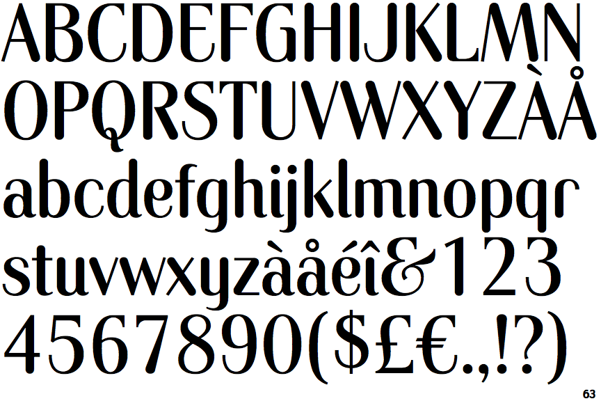
 |
The upper-case 'J' sits on the baseline.
|
 |
The dot on the '?' (question-mark) is circular or oval.
|
 |
The centre bar of the upper-case 'P' meets the vertical.
|
 |
The lower-case 'a' stem curves over the top of the bowl (double storey).
|
 |
The upper-case 'G' has a spur/tail.
|
 |
The upper-case 'Y' arms and tail are separate strokes.
|
 |
The 'l' (lower-case 'L') has a right-facing lower serif or tail.
|
 |
The upper-case 'J' has no bar.
|
 |
The leg of the upper-case 'R' is straight.
|
 |
The upper-case 'A' has tapered verticals.
|