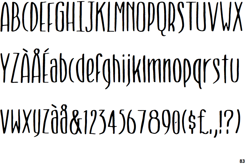
 |
The upper-case 'Q' tail touches the circle.
|
 |
The '$' (dollar) has a single line which does not cross the 'S'.
|
 |
The '&' (ampersand) is traditional style with two enclosed loops.
|
 |
The upper-case 'J' has a bar both sides.
|
 |
The leg of the upper-case 'R' is curved outwards.
|
 |
The upper-case letter 'I' has serifs/bars.
|
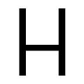 |
The bar of the upper-case 'H' is below centre.
|
Note that the fonts in the icons shown above represent general examples, not necessarily the two fonts chosen for comparison.
Show Examples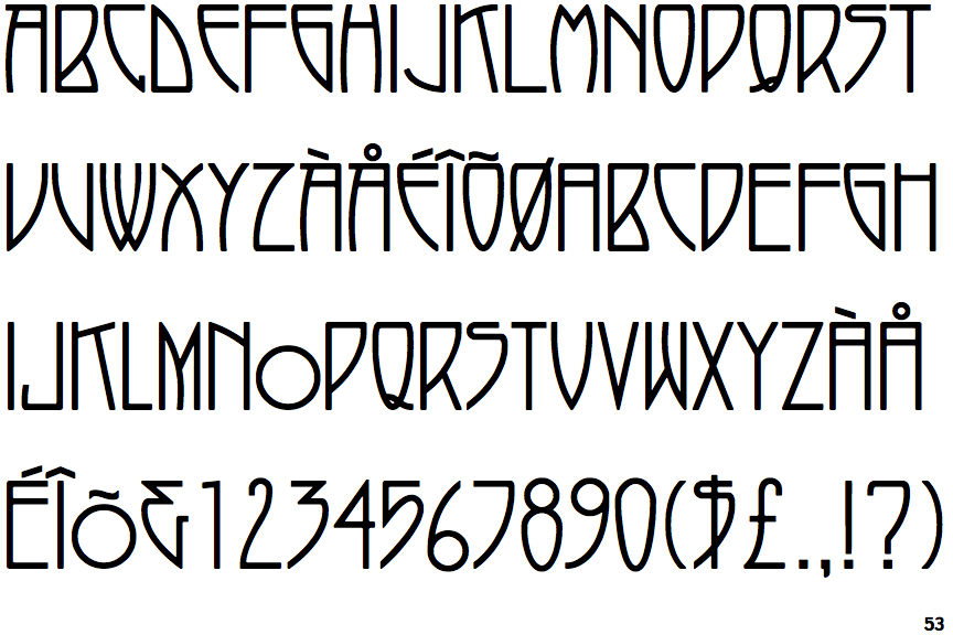
 |
The upper-case 'Q' tail crosses the circle.
|
 |
The '$' (dollar) has a single line crossing the 'S'.
|
 |
The '&' (ampersand) looks like 'Et' with a gap at the top.
|
 |
The upper-case 'J' has no bar.
|
 |
The leg of the upper-case 'R' is straight.
|
 |
The upper-case letter 'I' is plain.
|
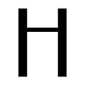 |
The bar of the upper-case 'H' is above centre.
|