Identifont

Fonts by Appearance

Fonts by Name

Fonts by Similarity

Fonts by Picture

Fonts by Designer/Publisher

Differences

TweetTweet Differences

Compare: and  

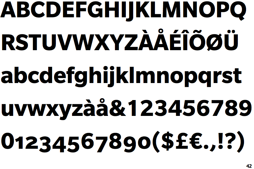
Slate Bold

Slate Bold

Below
The upper-case 'J' descends below the baseline.
Closed
The '4' is closed.
Round
The top storey of the '3' is a smooth curve.
Spur
The upper-case 'G' has a spur/tail.
Left
The upper-case 'G' has a bar to the left.
Plain
The upper-case 'J' has no bar.

Note that the fonts in the icons shown above represent general examples, not necessarily the two fonts chosen for comparison.

Show Examples
Montserrat Bold

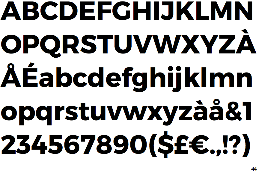
Montserrat Bold

On
The upper-case 'J' sits on the baseline.
Open
The '4' is open.
Angled
The top storey of the '3' is a sharp angle.
No spur
The upper-case 'G' has no spur/tail.
No bar
The upper-case 'G' has no bar.
Single-bar
The upper-case 'J' has a bar to the left.