 |
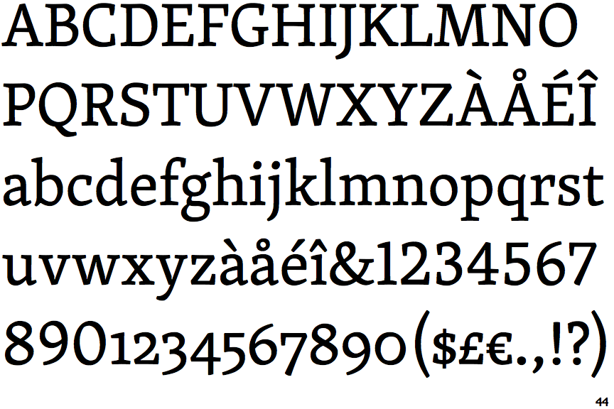
The diagonal strokes of the upper-case 'K' meet in a 'T'.
|
 |
The top of the upper-case 'A' has no serifs or cusps.
|
 |
The centre bar of the upper-case 'E' has no serifs.
|
 |
The upper-case 'G' foot has no spur or serif.
|
 |
The top of the lower-case 'q' has a vertical or slightly angled spur (pointed or flat).
|
 |
The centre vertex of the upper-case 'W' has no serifs.
|
 |
The bar of the upper-case 'G' is double-sided.
|
 |
The lower-case 'e' has a straight horizontal bar.
|
 |
The centre bar of the upper-case 'F' has no serifs.
|
 |
The top vertices of the upper-case 'M' have symmetrical single-sided serifs.
|
Note that the fonts in the icons shown above represent general examples, not necessarily the two fonts chosen for comparison.
Show Examples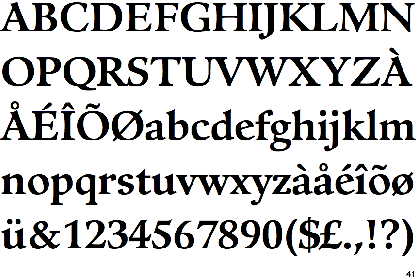
 |
The diagonal strokes of the upper-case 'K' meet at the vertical (with or without a gap).
|
 |
The top of the upper-case 'A' has a serif or cusp on the left.
|
 |
The centre bar of the upper-case 'E' has serifs.
|
 |
The upper-case 'G' foot has a forward pointing spur or serif.
|
 |
The top of the lower-case 'q' has no spur or serif.
|
 |
The centre vertex of the upper-case 'W' has two separate serifs.
|
 |
The bar of the upper-case 'G' is single-sided, left-facing.
|
 |
The lower-case 'e' has a straight angled bar.
|
 |
The centre bar of the upper-case 'F' has serifs.
|
 |
The top vertices of the upper-case 'M' have symmetrical double-sided serifs.
|