 |
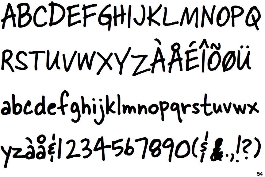
The upper-case 'Q' tail crosses the circle.
|
 |
The '&' (ampersand) looks like an 'E' with a solid or broken line.
|
 |
The lower-case 'g' is single-storey (with or without loop).
|
 |
The upper-case 'G' has a spur/tail.
|
 |
The upper-case 'J' has no bar.
|
 |
The sides of the lower-case 'y' are angled (V-shaped).
|
 |
The upper-case letter 'I' is plain.
|
 |
The upper-case 'I' is a single stroke with no serifs.
|
Note that the fonts in the icons shown above represent general examples, not necessarily the two fonts chosen for comparison.
Show Examples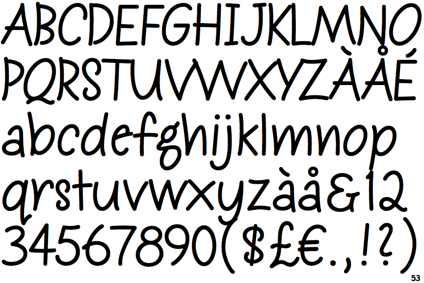
 |
The upper-case 'Q' tail touches the circle.
|
 |
The '&' (ampersand) looks like 'Et' with a gap at the top.
|
 |
The lower-case 'g' is double-storey (with or without gap).
|
 |
The upper-case 'G' has no spur/tail.
|
 |
The upper-case 'J' has a bar both sides.
|
 |
The sides of the lower-case 'y' are parallel (U-shaped).
|
 |
The upper-case letter 'I' has serifs/bars.
|
 |
The upper-case 'I' is a single stroke with serifs.
|