 |
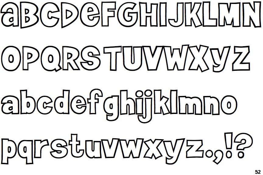
The lower-case 'a' stem curves over the top of the bowl (double storey).
|
 |
The upper-case 'G' has a bar to the left.
|
 |
The upper-case 'Y' right-hand arm forms a continuous stroke with the tail.
|
 |
The right side of the upper-case 'G' is curved.
|
 |
The dot on the lower-case 'i' or 'j' is circular or oval.
|
 |
The lower-case 'u' has a stem/serif.
|
Note that the fonts in the icons shown above represent general examples, not necessarily the two fonts chosen for comparison.
Show Examples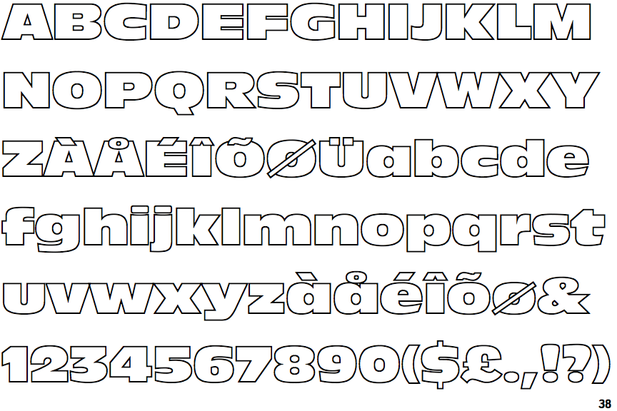
 |
The lower-case 'a' stem stops at the top of the bowl (single storey).
|
 |
The upper-case 'G' has no bar.
|
 |
The upper-case 'Y' arms and tail are separate strokes.
|
 |
The right side of the upper-case 'G' has a flat section.
|
 |
The dot on the lower-case 'i' or 'j' is square or rectangular.
|
 |
The lower-case 'u' has no stem/serif.
|