Identifont

Fonts by Appearance

Fonts by Name

Fonts by Similarity

Fonts by Picture

Fonts by Designer/Publisher

Differences

TweetTweet Differences

Compare: and  

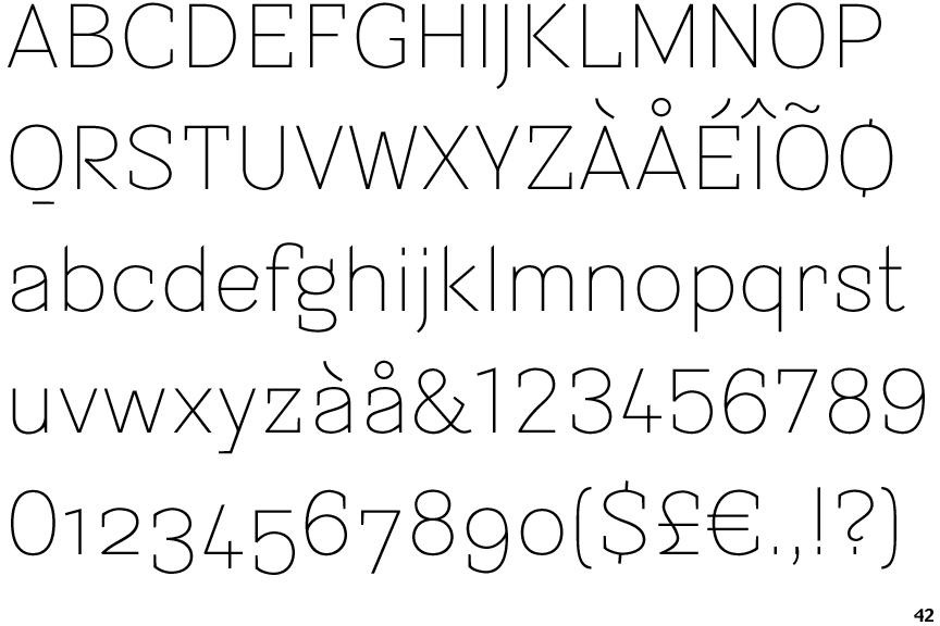
Sintesi Semi Sans Ultra Thin

Sintesi Semi Sans Ultra Thin

Below
The upper-case 'Q' tail is below and separated from the circle.
Below
The upper-case 'J' descends below the baseline.
Open
The '4' is open.
Round
The top storey of the '3' is a smooth curve.
2-Storey
The lower-case 'g' is double-storey (with or without gap).
2-Storey
The lower-case 'a' stem curves over the top of the bowl (double storey).

Note that the fonts in the icons shown above represent general examples, not necessarily the two fonts chosen for comparison.

Show Examples
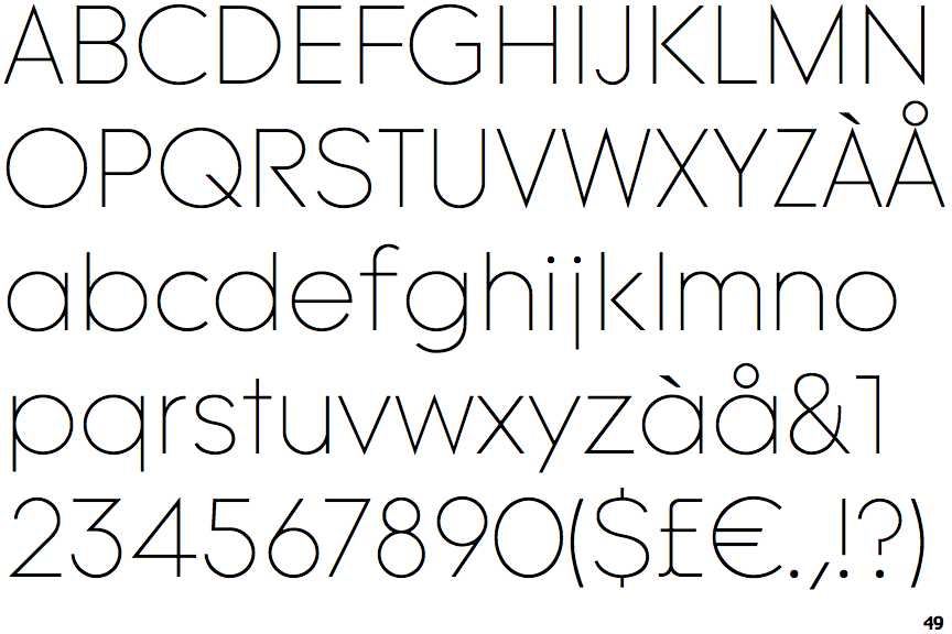
Tomica Thin

Tomica Thin

Crosses
The upper-case 'Q' tail crosses the circle.
On
The upper-case 'J' sits on the baseline.
Closed
The '4' is closed.
Angled
The top storey of the '3' is a sharp angle.
1-Storey
The lower-case 'g' is single-storey (with or without loop).
1-Storey
The lower-case 'a' stem stops at the top of the bowl (single storey).