Identifont

Fonts by Appearance

Fonts by Name

Fonts by Similarity

Fonts by Picture

Fonts by Designer/Publisher

Differences

TweetTweet Differences

Compare: and  

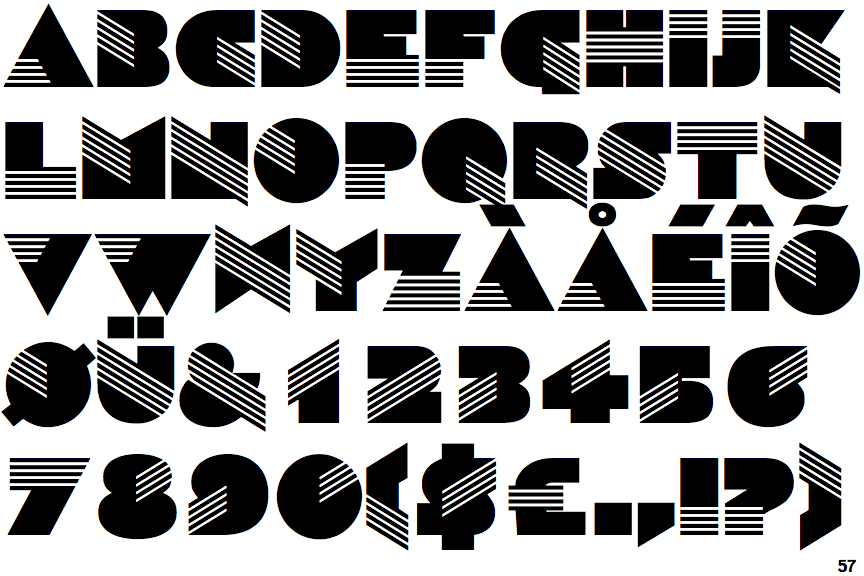
Sinaloa

Sinaloa

Parallel
The verticals of the upper-case 'M' are parallel.
Round
The top storey of the '3' is a smooth curve.
Spur
The upper-case 'G' has a spur/tail.
Three
The upper-case 'Y' arms and tail are separate strokes.
Tapered
The upper-case 'A' has tapered verticals.

Note that the fonts in the icons shown above represent general examples, not necessarily the two fonts chosen for comparison.

Show Examples
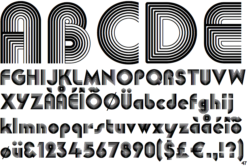
Linea

Linea

Sloping
The verticals of the upper-case 'M' are sloping.
Angled
The top storey of the '3' is a sharp angle.
No spur
The upper-case 'G' has no spur/tail.
Two
The upper-case 'Y' right-hand arm forms a continuous stroke with the tail.
Parallel
The upper-case 'A' has parallel verticals.