 |
The upper-case 'Q' tail crosses the circle.
|
 |
The '&' (ampersand) looks like 'Et' with one enclosed loop (with or without exit stroke).
|
 |
The diagonal strokes of the upper-case 'K' meet in a 'T'.
|
 |
The dot on the '?' (question-mark) is square or rectangular.
|
 |
The lower-case 'g' is single-storey (with or without loop).
|
 |
The 'l' (lower-case 'L') has a right-facing lower serif or tail.
|
 |
The right side of the upper-case 'G' is curved.
|
 |
The dot on the lower-case 'i' or 'j' is square or rectangular.
|
 |
The bar of the lower-case 'f' is double-sided.
|
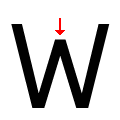 |
The centre vertex of the upper-case 'W' is below the outer strokes.
|
Note that the fonts in the icons shown above represent general examples, not necessarily the two fonts chosen for comparison.
Show Examples
 |
The upper-case 'Q' tail touches the circle.
|
 |
The '&' (ampersand) is traditional style with two enclosed loops.
|
 |
The diagonal strokes of the upper-case 'K' meet at the vertical (with or without a gap).
|
 |
The dot on the '?' (question-mark) is circular or oval.
|
 |
The lower-case 'g' is double-storey (with or without gap).
|
 |
The 'l' (lower-case 'L') has no serifs or tail.
|
 |
The right side of the upper-case 'G' has a flat section.
|
 |
The dot on the lower-case 'i' or 'j' is circular or oval.
|
 |
The bar of the lower-case 'f' is single-sided.
|
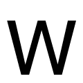 |
The centre vertex of the upper-case 'W' is level with the outer strokes.
|