Identifont

Fonts by Appearance

Fonts by Name

Fonts by Similarity

Fonts by Picture

Fonts by Designer/Publisher

Differences

TweetTweet Differences

Compare: and  

Simplon Mono

Simplon Mono

Crosses
The upper-case 'Q' tail crosses the circle.
Open
The '&' (ampersand) is traditional style with a gap at the top.
Double
The diagonal strokes of the upper-case 'K' meet in a 'T'.
Curved
The right side of the upper-case 'G' is curved.

Note that the fonts in the icons shown above represent general examples, not necessarily the two fonts chosen for comparison.

Show Examples
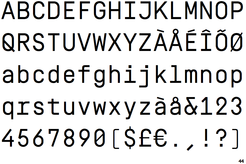
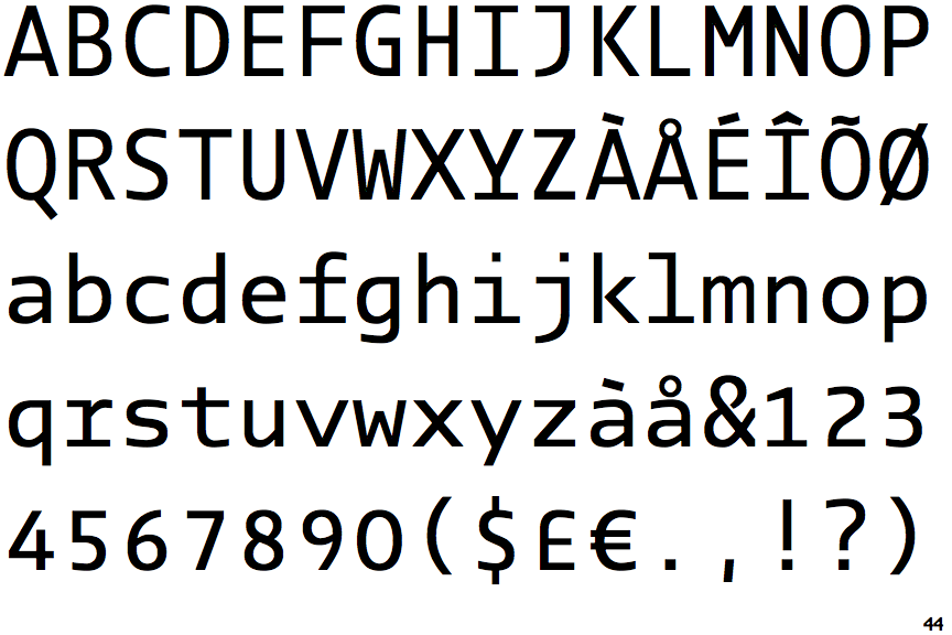
PTL Manual Mono TF

PTL Manual Mono TF

Touches
The upper-case 'Q' tail touches the circle.
Closed
The '&' (ampersand) is traditional style with two enclosed loops.
Single
The diagonal strokes of the upper-case 'K' meet at the vertical (with or without a gap).
Flat
The right side of the upper-case 'G' has a flat section.