Identifont

Fonts by Appearance

Fonts by Name

Fonts by Similarity

Fonts by Picture

Fonts by Designer/Publisher

Differences

TweetTweet Differences

Compare: and  

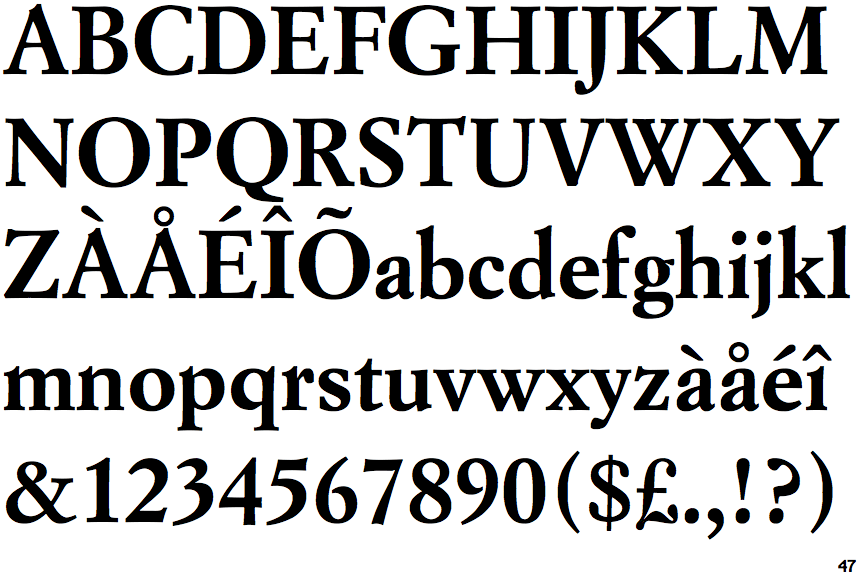
Simoncini Garamond Bold

Simoncini Garamond Bold

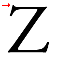
Double
The top stroke of the lower-case 'z' has a vertical or angled upward-pointing serif.
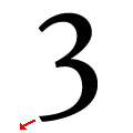
Downwards
The lower stroke of the '3' points downwards.

Note that the fonts in the icons shown above represent general examples, not necessarily the two fonts chosen for comparison.

Show Examples
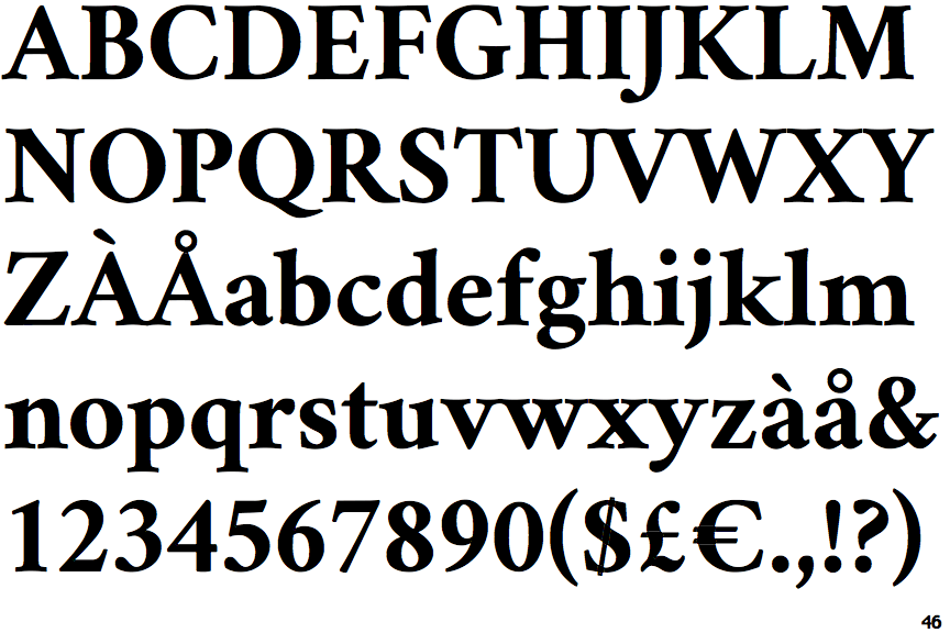
Crimson Text Bold

Crimson Text Bold

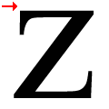
Single
The top stroke of the lower-case 'z' has no upward-pointing serif.
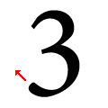
Upwards
The lower stroke of the '3' points upwards.