Identifont

Fonts by Appearance

Fonts by Name

Fonts by Similarity

Fonts by Picture

Fonts by Designer/Publisher

Differences

TweetTweet Differences

Compare: and  

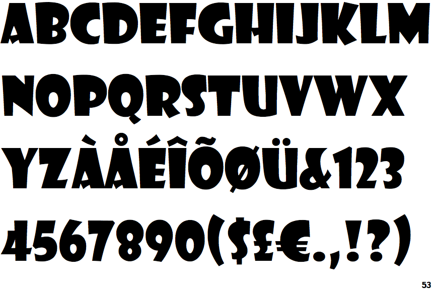
Showcard Gothic

Showcard Gothic

Open
The '&' (ampersand) is traditional style with a gap at the top.
Baseline
The centre vertex of the upper-case 'M' is on the baseline.
No spur
The upper-case 'G' has no spur/tail.
Normal
The upper-case 'E' is normal letter shape.
D shaped
The hole (counter) in the upper-case 'P' or 'R' is approximately D-shaped.

Note that the fonts in the icons shown above represent general examples, not necessarily the two fonts chosen for comparison.

Show Examples
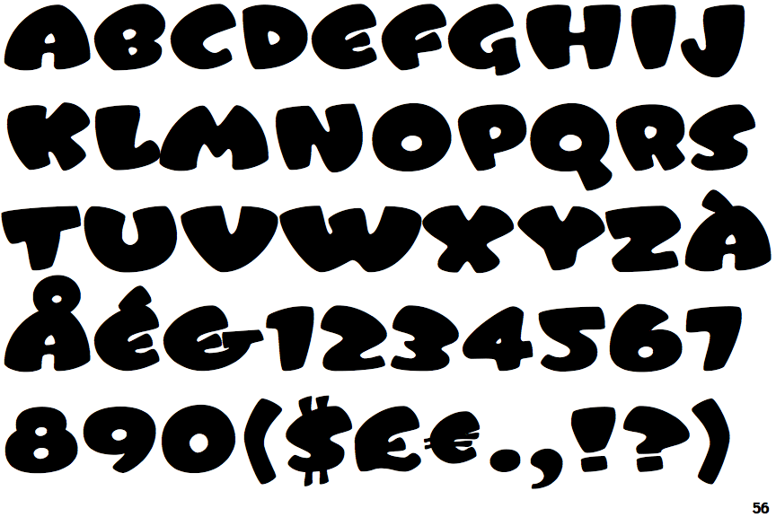
Tangerine

Tangerine

Gap top
The '&' (ampersand) looks like 'Et' with a gap at the top.
Above
The centre vertex of the upper-case 'M' is above the baseline.
Spur
The upper-case 'G' has a spur/tail.
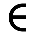
C-bar
The upper-case 'E' is drawn as a 'C' with a bar.
Circular
The hole (counter) in the upper-case 'P' or 'R' is circular or oval.