Identifont

Fonts by Appearance

Fonts by Name

Fonts by Similarity

Fonts by Picture

Fonts by Designer/Publisher

Differences

TweetTweet Differences

Compare: and  

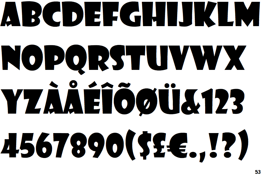
Showcard Gothic

Showcard Gothic

Open
The '&' (ampersand) is traditional style with a gap at the top.
Sans-serif
The characters do not have serifs.
Baseline
The centre vertex of the upper-case 'M' is on the baseline.
Low
The bar of the upper-case 'H' is below centre.

Note that the fonts in the icons shown above represent general examples, not necessarily the two fonts chosen for comparison.

Show Examples
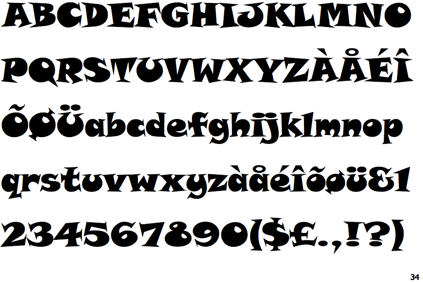
ITC Snap

ITC Snap

Gap top
The '&' (ampersand) looks like 'Et' with a gap at the top.
Serif
The characters have serifs.
Above
The centre vertex of the upper-case 'M' is above the baseline.
Central
The bar of the upper-case 'H' is vertically central.