 |
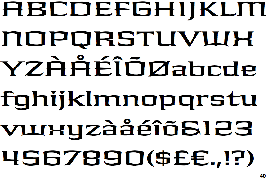
The upper-case 'Q' tail crosses the circle.
|
 |
The upper-case 'J' descends below the baseline.
|
 |
The '4' is open.
|
 |
The centre bar of the upper-case 'P' crosses the vertical.
|
 |
The upper-case 'U' has a stem/serif.
|
 |
The characters are solid.
|
 |
The top stroke of the upper-case 'C' has no upward-pointing serif.
|
 |
The upper-case 'G' foot has no spur or serif.
|
 |
The upper-case 'A' has parallel verticals.
|
 |
The centre bar of the upper-case 'R' crosses the vertical.
|
There are more than ten differences; only the first ten are shown.
Note that the fonts in the icons shown above represent general examples, not necessarily the two fonts chosen for comparison.
Show Examples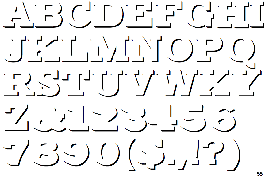
 |
The upper-case 'Q' tail touches the circle.
|
 |
The upper-case 'J' sits on the baseline.
|
 |
The '4' is closed.
|
 |
The centre bar of the upper-case 'P' meets the vertical.
|
 |
The upper-case 'U' has no stem/serif.
|
 |
The characters are outlined, shaded, or filled with a pattern.
|
 |
The top stroke of the upper-case 'C' has a vertical or angled upward-pointing serif.
|
 |
The upper-case 'G' foot has a downward pointing spur.
|
 |
The upper-case 'A' has tapered verticals.
|
 |
The centre bar of the upper-case 'R' meets the vertical.
|