Identifont

Fonts by Appearance

Fonts by Name

Fonts by Similarity

Fonts by Picture

Fonts by Designer/Publisher

Differences

TweetTweet Differences

Compare: and  

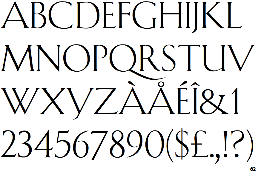
Shàngó

Shàngó

Gap
The centre bar of the upper-case 'P' leaves a gap with the vertical.
Two
The upper-case 'Y' right-hand arm forms a continuous stroke with the tail.
No top serif
The top stroke of the upper-case 'C' has no upward-pointing serif.
Four
The top of the upper-case 'W' has four upper terminals.

Note that the fonts in the icons shown above represent general examples, not necessarily the two fonts chosen for comparison.

Show Examples
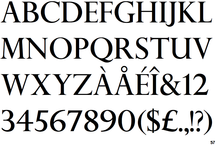
Perpetua Titling

Perpetua Titling

Meets
The centre bar of the upper-case 'P' meets the vertical.
Three
The upper-case 'Y' arms and tail are separate strokes.
Top serif
The top stroke of the upper-case 'C' has a vertical or angled upward-pointing serif.
Three
The top of the upper-case 'W' has three upper terminals.