 |
The '$' (dollar) has a single line crossing the 'S'.
|
 |
The top storey of the '3' is a smooth curve.
|
 |
The top stroke of the upper-case 'C' has a vertical or angled upward-pointing serif.
|
 |
The centre bar of the upper-case 'R' meets the vertical.
|
 |
The top of the upper-case 'W' has four upper terminals.
|
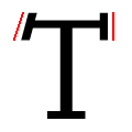 |
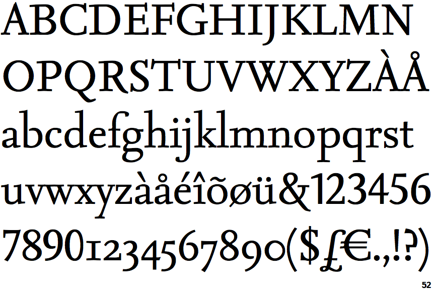
The serifs of the upper-case 'T' are one angled, one vertical.
|
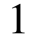 |
The lower-case 'l' has no spur.
|
Note that the fonts in the icons shown above represent general examples, not necessarily the two fonts chosen for comparison.
Show Examples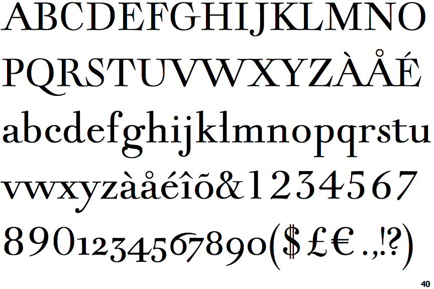
 |
The '$' (dollar) has a double line crossing the 'S'.
|
 |
The top storey of the '3' is a sharp angle.
|
 |
The top stroke of the upper-case 'C' has no upward-pointing serif.
|
 |
The centre bar of the upper-case 'R' leaves a gap with the vertical.
|
 |
The top of the upper-case 'W' has three upper terminals.
|
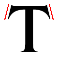 |
The serifs of the upper-case 'T' are angled in opposite directions.
|
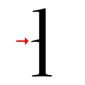 |
The lower-case 'l' has a left-facing spur at mid-height.
|