Identifont

Fonts by Appearance

Fonts by Name

Fonts by Similarity

Fonts by Picture

Fonts by Designer/Publisher

Differences

TweetTweet Differences

Compare: and  

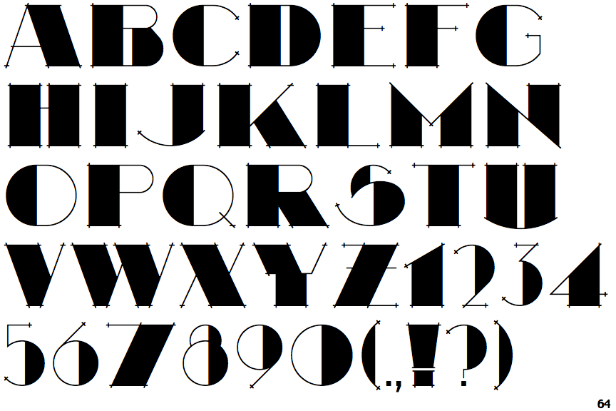
Searsucker Bold

Searsucker Bold

Left
The upper-case 'G' has a bar to the left.
Straight
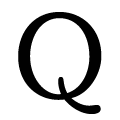
The tail of the upper-case 'Q' is straight.
Stepped-Left
The centre strokes of the upper-case 'W' meet in a T on the left.

Note that the fonts in the icons shown above represent general examples, not necessarily the two fonts chosen for comparison.

Show Examples
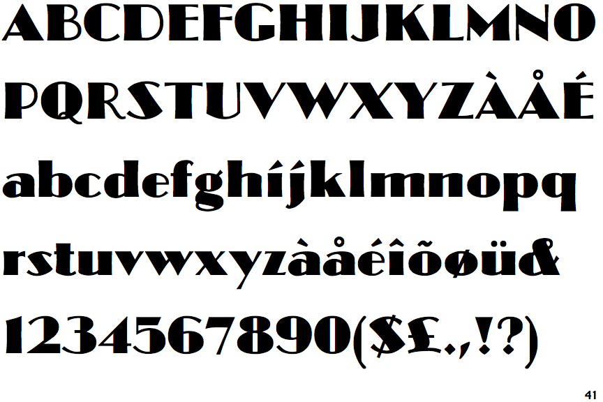
Ultramodern Classic SG

Ultramodern Classic SG

No bar
The upper-case 'G' has no bar.
Curved
The tail of the upper-case 'Q' is curved or S-shaped.
Vertex
The centre strokes of the upper-case 'W' meet at a vertex.