Identifont

Fonts by Appearance

Fonts by Name

Fonts by Similarity

Fonts by Picture

Fonts by Designer/Publisher

Differences

TweetTweet Differences

Compare: and  

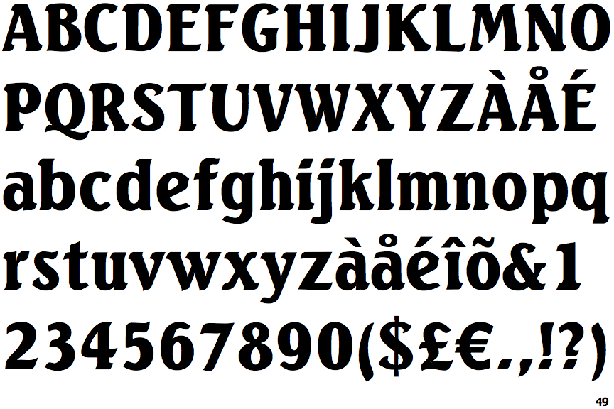
Seagull Black (URW)

Seagull Black (URW)

Open
The '&' (ampersand) is traditional style with a gap at the top.
On
The upper-case 'J' sits on the baseline.
Above
The centre vertex of the upper-case 'M' is above the baseline.
1-Storey
The lower-case 'g' is single-storey (with or without loop).
Curved
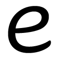
The lower-case 'e' has a curved bar with no straight segment.

Note that the fonts in the icons shown above represent general examples, not necessarily the two fonts chosen for comparison.

Show Examples
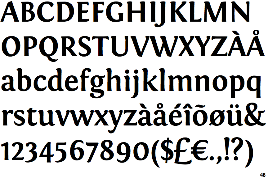
Fontin Bold

Fontin Bold

Closed
The '&' (ampersand) is traditional style with two enclosed loops.
Below
The upper-case 'J' descends below the baseline.
Baseline
The centre vertex of the upper-case 'M' is on the baseline.
2-Storey
The lower-case 'g' is double-storey (with or without gap).
Horizontal
The lower-case 'e' has a straight horizontal bar.