Differences
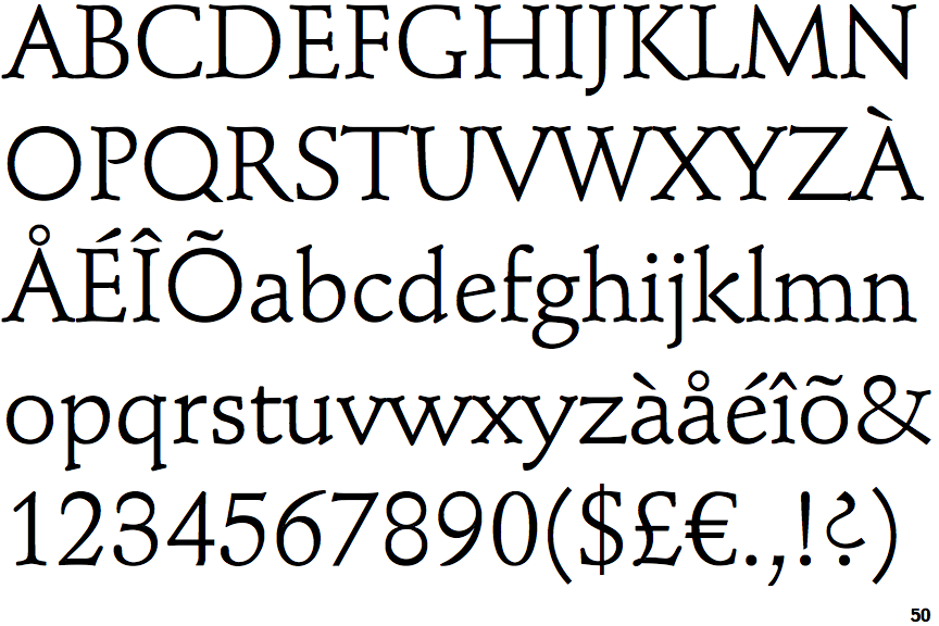
Schneidler Mediaeval
 |
The '&' (ampersand) is traditional style with two enclosed loops.
|
 |
The centre bar of the upper-case 'P' leaves a gap with the vertical.
|
 |
The lower-case 'g' is double-storey (with or without gap).
|
 |
The lower-case 'a' stem curves over the top of the bowl (double storey).
|
 |
The upper-case 'Y' arms and tail are separate strokes.
|
 |
The centre bar of the upper-case 'E' has serifs.
|
 |
The upper-case 'E' is normal letter shape.
|
 |
The bar of the upper-case 'G' is double-sided.
|
 |
The centre bar of the upper-case 'F' has serifs.
|
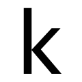 |
The diagonal strokes of the lower-case 'k' meet at the vertical (with or without a gap).
|
There are more than ten differences; only the first ten are shown.
Note that the fonts in the icons shown above represent general examples, not necessarily the two fonts chosen for comparison.
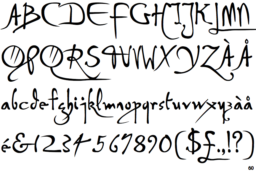
Show ExamplesP22 Da Vinci Forward
 |
The '&' (ampersand) looks like 'Et' with a gap at the top.
|
 |
The centre bar of the upper-case 'P' crosses the vertical.
|
 |
The lower-case 'g' is single-storey (with or without loop).
|
 |
The lower-case 'a' stem stops at the top of the bowl (single storey).
|
 |
The upper-case 'Y' right-hand arm forms a continuous stroke with the tail.
|
 |
The centre bar of the upper-case 'E' has no serifs.
|
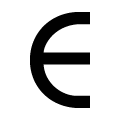 |
The upper-case 'E' is drawn as a 'C' with a bar.
|
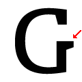 |
The bar of the upper-case 'G' is single-sided, right-facing.
|
 |
The centre bar of the upper-case 'F' has no serifs.
|
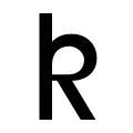 |
The diagonal strokes of the lower-case 'k' form a loop.
|
